David Stairs
While most people these days don’t think much about cattle when they discuss branding, they also probably don’t focus on Apple’s iconic 1984 Superbowl ad as the catalyst for a whole new generation of brand differentiation. Yet, the upsurge of interest in brand fascination is traceable to the 1980s and its emphasis on supply-side economics.
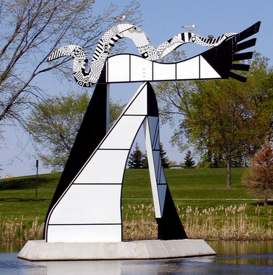
CMU’s Centennial Sculpture, by Charles McGee (installed 1992; relocated 1999; birds voluntary)
When I finally became part of the academy in 1994, my land-grant institution had recently celebrated its centenary. To mark this occasion, it invested in two things: a sculpture, and a logo. For the centennial sculpture, a committee commissioned Detroit artist Charles McGee, whose black-and-white enameled steel “Gateway Sculpture” was later moved from the center of campus to a small island in the middle of a remote pond. The centennial logo, later referred to as “the outhouse,” fared even worse. A variation on the “Old Main” trope of university logos, the campanile of Warriner Hall marque, gone and all but forgotten, was replaced less than a decade later with a word mark.
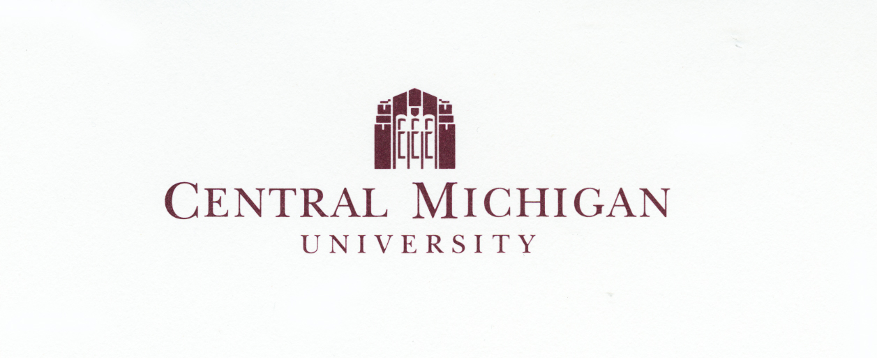
Central’s Centennial logo, the “Outhouse” 1992
About two years after I arrived on campus, a new marque was created by a student of mine who moonlighted as a work study student at athletic marketing. This marque, later referred to as the Action C, was an extra-bold obliqued sans serif cap C with speed lines and the drop shadow that defined so much design of the late ’90s.
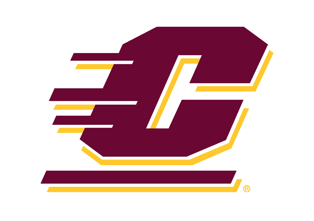
The Action C, 1996
Earlier in the century, Central’s mascot had for a time been known as the Bearcats. At some point, this designation changed to the Chippewas, named for the local band of Anishinaabe people, the Saginaw Ojibwas. This created a marketing problem for the school by the PC end of the century. The Bearcat logo had been a cap C, and the Action C reverted to this style, updating it while allowing the school to retain the Chippewa nickname with tribal consent, so long as it was used respectfully and did not promote stereotypes.
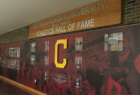
Central’s old “Bearcat C”
My only connection to any of these marques was to the 2001 university word mark. In the midst of a contentious public discussion, where the Associate Vice President for Marketing was taking heavy ordnance over outsourcing $12,000 for a new mark, I suggested the typeface that ultimately settled the debate, Emigre’s Fairplex. This experience taught me that the public holds a pretty high estimation of its own design taste, whether or not it owns the knowledge or expertise that goes with it.

The CMU Wordmark, 2001
A decade-and-a-half later, a new AVP, herself a CMU alum, embarked on a scorched-earth branding campaign in an effort to control all secondary marks on campus. In addition to the wordmark and Action C, the university occasionally used a great seal, and many on-campus entities had made their own logos. Her solution: make everything bleed institutional colors, in this case maroon and gold. Thereafter, every webpage, poster, sweatshirt, coffee mug, and publication assumed a predictable sameness, and designers working for the university had to learn to dream in PMS 209 (maroon) and 123 (gold).
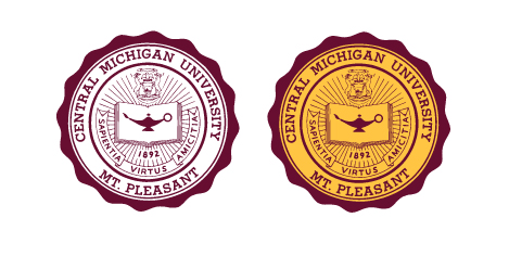
The university seal
These days, most universities adhere to a rigidly protectionist policy toward their property, including logo and color palette. After all, such simple things are the stuff of nostalgia for thousands of alums, hence, potential donors and purchasers of university branded clothing and swag. Never mind that none of this stuff is produced by universities, but by a large echelon of licensed marketers and secondary producers with university branding agreements.
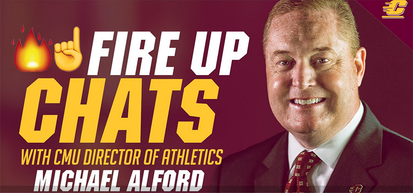
An example of current university branding
Yet, I can’t help but think that something essential has been lost in this rush to proprietize the university’s image. Perhaps it can’t be offset by the monetary gold PMS 123 bestows on CMU, but the rigidity imposed by such “branding standards,” while state-of-the-practice, reduces flexibility, and ultimately forestalls potential creativity. I know because my department’s efforts to develop a not-maroonandgold website to try to compete with other arts institutions was completely shut down, with the resultant university-imposed website one horse-snort shy of hilarious. The irony is that enrollments are tanking in the era of Trumpification. Michigan is bleeding population and jobs, with the pool of available 18-year-olds every institution is competing for accordingly reduced.
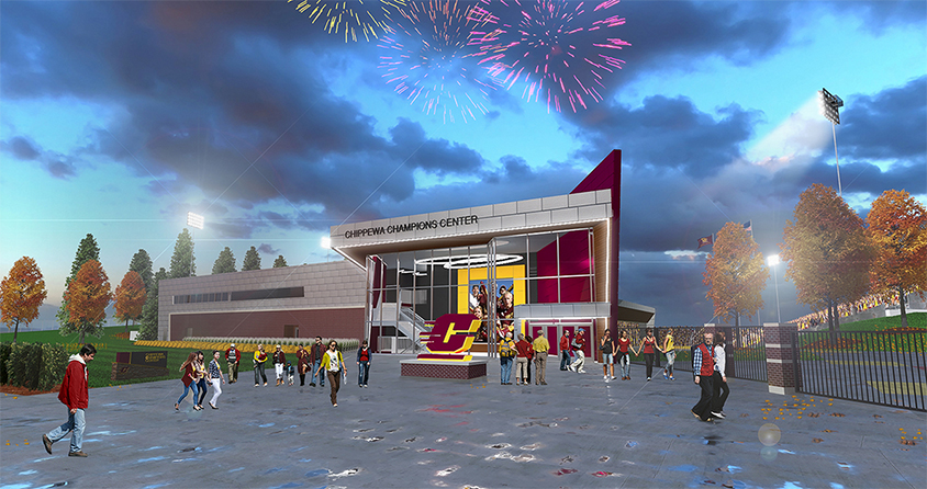
Architect’s rendering of Central’s proposed Alumni Center, with an Action C sculpture out front
I can’t say if/when this will ever improve. I’m biased to believe it may accompany a loosening of brand standards, and a return to unfettered creativity. Only time will tell. Meanwhile, all hail the Action C.
David Stairs is the founding editor of the Design-Altruism-Project

