Catherine Jo Ishino
Hong Kong and PRC Design from the Reform Era (ca.1978)
In the next two sections, I will explore how China’s marketplace, citizenry, and identity have begun to transform with its entry into the overarching globalization narrative that has been taking place since the last part of the 20th century. Specifically, I will focus on the visual changes as reflected through its graphic design over the period of the past 40 years in Hong Kong and Beijing. Primarily I do this for the sake of argument, as Dr. Wendy Wong rightly maintains the impossibility to totally separate one city’s development from the other. This became visually apparent especially since the thematic poster exhibitions and exchanges began and became so far reaching, so fast. These also created a new form of design education for the once isolated areas of China. I select these places because of the brevity of this essay, and so I may more clearly focus on Hong Kong and Beijing having disparate beginnings and present day comparisons.
Beijing was allowed entry onto the global stage during the Communist government’s Four Modernizations Policy1 in 1978, its Open Door Policy in 1979, and most recently the preparation for its debut of the 2008 Beijing Olympics. Hong Kong, under a hundred-year rule by the British Empire, returned to the Peoples Republic of China (PRC) in 1997. The latter city began to lose its momentum in the region as the design leader when it switched from the sole free capitalist economy and returned to the Mainland. Though Hong Kong has its own free market economy, it remains under the Communist Peoples Party regime. As a result, Hong Kong appeared to go through a visual identity crisis with what Wong terms ‘decolonization’ by the United Kingdom and ‘recolonization’ by the PRC.
Two Current Chinese Scholars on Chinese Graphic Design My whole point about this system is not that it is a misrepresentation of some Oriental essence — in which I do not for a moment believe — but that it operates as representations usually do, for a purpose, according to a tendency, in a specific historical, intellectual, and even economic setting. Edward Said, Orientalism, 1978 I will explore the current design scene in China through the English publications of two Chinese born scholars, Dr. Wendy Wong2 and Min Wang,3 whose specializations lie respectively in the design works of Hong Kong and Beijing.
I will examine how they perceive the transformations undergone in these two cities. I choose to do this, as I found through my broad reading on Chinese graphic design, these two academics held the most nuanced insights I could uncover, which I believe is due to their bicultural backgrounds. Both were born and grew up in China, then worked in the United States for numerous years. They speak and read fluently in Chinese and English. Also, these academics were former design practitioners and schooled in the Western as well as Modernist way of creating graphic design works.4 It is my belief these two people hold backgrounds that combine to create a unique cultural and social insight to Eastern and Western design sensibilities.
Hong Kong Graphic Design
…designer’s synthesis ability comes from… understanding, absorbing and grasping a myriad of social factors… multi-culture trends and diversified historical backgrounds… insight to culture, art, and society, both global and indigenous… [a] grip on aesthetics, human relations, market and technology. Min Wang5
As an in-depth example, I will refer to Wong’s highly informative paper, Design Identity of Hong Kong.6 She argues cultural products, such as graphic design, mirror ideological influences and changes. Furthermore, she states “Hong Kong’s colonial history, its design and cultural identity with Chinese characteristics has always been marginalized and discouraged under the British colonial rule.”7 Later when the territory returned to the Peoples Republic of China, it faced yet another dilemma – grappling with another form of colonization in the “PRC’s way.” So, Wong argues, Hong Kong simultaneously deals with its own “de-colonization” from Great Britain, while adjusting to “re-colonization” by the PRC. But once again, Wong states, the development of the individual design and cultural identity of Hong Kong is not preferred by its sovereign country, Beijing’s PRC government. She focuses the discussion on the difficulties and dilemmas Hong Kong design has had in the past and its current political and economic environment. She gives as a recent example, the Patriotism Campaign launched by the PRC. The advertising campaign was created to assert the PRC’s political and economic sovereignty over its newly adjoined territory. The Central Government’s notion was to widely promote the idea of ‘love of their motherland.’8 The mandate, made by the Committee on the Promotion of Civic Education, was to create advertisements to promote a new concept of loyalty. This visual campaign was imposing to the designers in Hong Kong, who were used to the ‘hands off’ policies of the British in the way they conducted their work.
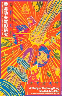
Previous to returning to the rule of the PRC, and the Brits impending withdrawal in 1997, Hong Kong actually had begun a local graphic resurgence during the mid-1980s. Pop culture and street life became a major source of inspiration and rejuvenation. Hong Kong went vernacular. However, the rejuvenation of an indigenous design aesthetic and renaissance was limited and localized. Dynamic film posters, area bar and restaurant adverts, as well as announcements for the city’s art shows were created in venues that typically allow much creative freedom. However, the design works did not become a globally popularized export style.9
Designer of ‘East meeting West’
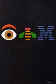
Henry Steiner, dubbed the ‘father of Hong Kong Design’, becomes the first bilingual and bicultural modernist designer, who leads the ‘East Meets West’ style that will later influence the next generation of Chinese designers. He arrives in the mid-1960s to work on one design project, and then stays permanently. Steiner is Austrian born, but French and American educated. Most significantly, he studied at Yale University under the master of Modernism in the USA, Paul Rand. Rand was an exemplar for aspiring American corporate designers during the mid-20th century.10 He created the IBM logo in 1956 and playfully innovated its identity through the 1980s.
Steiner incorporated two major Rand tenets in his own work, as learned from his mentor – “form follows concept,” and “create surprising contrasts in visual communication endeavors.” You can see the evidence of Rand’s principles, when the design master creates one of his most well known posters for IBM. Here, by using the actual images of the objects to replace the letters of the company, Rand creates a humorous rebus. The surprise is not only in his playful, child-like rendering of the eye and the bee, but also the juxtaposition to the company’s staid reputation as the ‘Big Blue Brother’.
Paul Rand
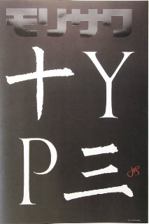
Steiner, himself, becomes masterful when he discovers his visual voice in Hong Kong and begins applying Rand’s principles to his bicultural British and Asian audiences. In his poster for a typesetting company, Steiner skillfully combines the Western letterforms, ‘Y’ and ‘P’, with Eastern calligraphic characters ‘ten’ and ‘three’, and stacks them one on top of one another to create the word, ‘type’. He describes the text as being a combination of Roman letters from 1570 with a Tang Dynasty calligrapher from 841 A.D. to form the final word and image. He also uses red ink to sign his name, signifying the ‘chop’ or seal, often used in Asia to stamp out one’s surname.
Henry Steiner
In the introduction to his 1995 book, Cross-Cultural Design: Communicating in the Global Marketplace, Steiner writes, “…societies prosper when they intermingle, when ideas and knowledge are transferred in … cultural cross-pollination.” Furthermore, in explaining the difficulties and nuances in the exchange of cultures in graphic design, he writes: “The ability to supply a visual statement that provides a direct, clear communication of the message is… imperative when working cross-culturally. They [the designers] must strive to transmit one set of messages within the medium of a foreign tradition without losing the meaning and attitude of the original concept. Designers venturing into the global marketplace need to be sensitive to cultural conventions as they are uninhibited in finding new ways to exploit them.” Beyond the visual integration and power of his design works, his clients are highly visible operations throughout the East.11
Included in Steiner’s wide-ranging client list are such establishments as banks (HSBC, Standard Chartered Bank), publications (Asiaweek, Far Eastern Economic Review), real estate (Shanghai Mart, Hongkong Land), retail (Duty Free Shoppers, Unilever China) and the public sector (Hong Kong Post Office, Hong Kong Tourist Association) among many others. As a result of his work he has garnered countless design awards. In addition, Steiner has become highly active in global and local design organizations: he served as President to two major groups – ICOGRADA and AGI.12 He has influenced a generation of global and cross-cultural designers with his works that combine English and Chinese symbolism, typography and visuals. PRC and Beijing Designers are… playing an important role in balancing the Globalization and Nationalization, Unification and Diversification.
Potentials of being able to understand the interactions between native culture and the trend of globalization rightly justify their roles to be messengers of cultural communications…The world needs a visual language to facilitate the communication and understanding among people with various backgrounds, and this visual language can only be drawn on in-depth knowledge of diverse cultures. Min Wang Leading the Mainland Chinese designers, Xu Wang, prominently stands out. In 1998, he was nicknamed Graphic Design’s Evangelist in China by Europe’s main design magazine, Graphis.13 This title was bestowed upon him, as he was widely known for getting the word out to the West about what’s been going on with China’s design. He frequently gives lecture tours, and distributes his design books and magazines throughout Europe and the USA. Also, Xu Wang continues to do his own work, primarily for art and museum venues, and participates in the regional thematic invitationals. His avid energy and work is felt throughout the global design community.
As a young man, he lived and worked in Hong Kong from 1986 to 1995 (where he might have seen and been influenced by Henry Steiner’s work). Then Xu Wang returned to his hometown of Guangzhou,14 where he confidently began his own design studio and publishing company. Two years later, he started a self-published, bilingual graphic design magazine in English and Chinese, called the Design Exchange. The publication became “the most influential and widely circulated graphic design magazine in all of China,” even garnering the support and praise of Henry Steiner. In 1993, for Print magazine,15 Min Wang and his wife, Xiao Hong Shen, a cross-cultural studies scholar,16 wrote an article, called “After Mao: Chinese Graphic Design Today.”17
Beijing designers
In their coverage, they praised Wang Xu’s work. The couple decided to return to the PRC, after living in the USA since the early 1980s, for a design tour. In their writing, they revealed what they found in their travels and explorations. Both indicated Xu Wang’s work most fully integrates Euro-American and Chinese cultures, and they focused on his work at length. Min Wang and Shen pointed out, though Wang’s major emphasis was on visual elements that will cross cultures, his perspective remained Chinese. The writers felt his work seamlessly fused contemporary and Western means of design conception and manifestation. In finishing up their extensive survey of PRC designers, the authors respectfully gave Wang the last word: “…to have our own identity and to improve our design by gaining nourishment from our rich Chinese culture and traditions is a challenge for us all.”
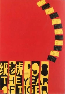
Xu Wang further exemplified his cross-cultural abilities in an annual poster for a paper production company. He plays with the notion of representing the Chinese zodiac Year of the Tiger.18 The yellow and black stripes of the tail make up and display the 12 months of the Western calendar year. The body of the animal is positioned more in a Western gestalt art perspective. The legs and head of the Tiger are out of the picture, but the viewer’s mind’s eye fills in the missing parts. The type is constructed both in Chinese characters and in the Roman alphabet, comprising both the stripes of the Tiger and the poster’s title. The colors red and gold are the luckiest ones in China. Red symbolizes “good luck, joy, good fortune, and fertility.” The yellow was only used by the Imperial family and still holds a notion of power and royalty in it. Yellow also symbolizes “joy, happiness, high spirits and sunshine”; much like in the West. The color black carries all meaning and nuance of water in the West. It stands for “depth, truth, life and stability.” (Peterson, Cullen, 2000, p. 148)
Xu Wang
Seven years later, the maturity of his work can be seen. In his poster,19 designed in memory of the atomic bombing of Hiroshima, we can see him fulfilling his own earlier Chinese design challenge that he had set out for himself. Here one can see some of the strokes, in the Chinese characters representing the name of the city, are missing. A reviewer wrote of Xu Wang’s poster that he intentionally does this to evoke the absence of Hiroshima’s people 60 years later. The bold, black paint strokes coming from the upper right hand sign, have a double entendre, symbolizing human bones coming crashing down from the sky and ‘black rain’ or what the nuclear fallout was described as at ground zero. Also, calligraphy remains the highest art form in China, so Xu Wang is revealing his skill here as well. The bravado and confidence of his ‘Chinese-ness’ (Wong, 2003), is highly visible, occupying the majority of the space. Note the placement and use of the English title, small, in the lower left-hand frame of the poster – it would be the last to be read in Chinese. As a reader in China, one would traditionally read top to bottom, right to left. Wang composed the title with a sans serif, Modernist typeface, but laid out in an archetypal Post-Modernist manner. The lines of type are of varying sizes and scales to emphasize the key words in an intuitive manner. Xu Wang directs the viewer to read the English with his directives. Here ‘60th’ and the city of ‘Hiroshima’ are writ large. The background color of white is a symbol for ‘death and mourning’ in Asia.
Beyond my description of the use of the color black in Chinese visual communication, it also may represent “mystery and even danger” (Peterson, Cullen, 2000, p. 149). “An overabundance of white space around … an isolated… lettering might [also] hint at funerary meanings.” In his later work, Xu Wang’s ideal of Chinese graphic design becoming modernized as well as retaining its own cultural identity, stands out clearly.

Xu Wang
Bingnan Yu
In 2004, I conducted a series of video interviews with three different generations of designers at the Alliance Graphic Internationale (AGI)20 conference. This historic assembly was being held in Beijing for the first time ever. Through my conversations among the first two generations, I discovered the desire to retain a sense of cultural agency in the globalized graphic design world remained stronger than ever. The first generation grew up under Mao Zedong from 1949. They practiced design up to the Cultural Revolution in 1956, then artists and academics were sent to the countryside to work with the peasantry as laborers and then re-emerged with the 1978 Four Modernizations Policy.21 The first generation of designers was the most adamant about retaining their cultural heritage and roots. The second generation, born after Mao’s Cultural Revolution, often sought to be schooled overseas in East Germany or the former Soviet Union, and later in the USA or Europe.
Quite a number of these ex-patriots have returned in an effort to help rebuild their country, often filled with a renewed and refreshed sense of national and cultural pride. The third generation were toddlers during the beginning of the Open Door Policy of 1979. As a result, these young adults in their late 20s remember and know little else, except growing up during the opening up of China’s free market economy. On describing the differing experiences of the generations of designers in terms of their relations to technology, renowned Chinese design curator, Ou Ning, explains: “… since China’s social and political reforms began in 1979, there have been three generations in Chinese design. Until the early 1990s, the first generation still created mainly handmade work, as there were few computers in the country. The second embraced the Macintosh and began to absorb international design influences. The third… grew up in the age of the Internet with access to information not available to earlier Chinese designers. They have an international outlook… share the independent DIY [Do It Yourself] spirit found in young designers the world over.” 22
Beyond these technological divisions pertinent in the contemporary profession and practice of graphic design, I include excerpts and paraphrases from my article published, at Oxford University Press’ Journal of Design History in 2006.23 In my interviews with the designers they describe the distinct sentiments of the different age groups, each in turn. Bingnan Yu (b. 1933) was my first interviewee. He was the initiator and main organizer of the first AGI annual conference to be held in Beijing. In 1992, Yu was the first PRC designer to become a member of AGI, nominated by the ‘father of Hong Kong design’ Henry Steiner. Yu was a Professor at the Academy of Art and Design at Tsinghua [Peking] University. [Yu was sent to the countryside during the Cultural Revolution to be a wood worker.] To an outsider of Chinese culture like me, Yu Bingnan, a lean man austerely dressed in a dark shirt and trousers, was reminiscent in appearance and attitude…[of] a Politburo leader, as shown in the National Congress Party of China on US television. This revealed my own stereotypical representations and…visual cultural references. Since Yu Bingnan had practiced before and after the ‘ free-market ’ economy, I was hoping he would provide me with a broad perspective on his country’s design. Speaking through an interpreter, he explained to me: “Today graphic design in China is more professional and mature. Yet our design is at an early stage of its development and potential. Right now, our graphic design level is finally capable of setting up a dialogue with our design counterparts worldwide and on a more equal standing. I know these exchanges are helping with our progress in graphic design. … Younger and more brilliant designers are emerging. There is a lot of potential for commerciality. There is professionalism in the near future. Younger designers are more sensitive to new and better designs than the older generation. But with their [desire for] individualism, they must remember their culture.” [Yu Bingnan was one of main organizers of the Themed Invitational Poster Exhibitions.]
Song Xiewei
The next interview I conducted was with Song Xiewei (b. 1963), 24 years younger than Yu Bingnan, and also mediated through the interpreter. Song’s hairstyle was a shoulder length, layered cut, very modern and hip as well as unusual for men on the streets of Beijing. Also, unlike my earlier interviewee, Song smiled frequently. A self-described artist/designer/tutor and associate professor, Song teaches at the Central Academy of Fine Arts (CAFA). He has his own eponymous independent design practice and was treated by the young designers at the AGI Conference as a celebrity. Conceivably, Song had attained this status because he was among the first in the PRC to implement a European design studio that was thriving and highly successful. Song is well-known and popular for being able to place the majority of his interned students in good jobs. Upon his recommendations and contacts, these budding designers enter at high level and start out at high paying design jobs in Beijing. Nationally and internationally, he had won scores of prestigious design awards. His exalted lifestyle involves frequent travels throughout Europe, Canada and the USA. Song Xiewei seemed to epitomize design success in the New China. His [expansive, floor through] designer penthouse studio overlooking all of Beijing was evidence of his success.24 He says about the design world today in the PRC: “In the past, we focused on functionality, the basic elements of design. Today, with the advancement of high-end information technology, our way of living and even our way of thinking has been greatly changed. Currently, our design is focused on the humanistic side and individualist expression in our work. Young designers and students’ work expresses the visual language of the era of high tech. They grew up in it, they depend on it. They are more in the modern era — cross-cultural and international. Consider their education. They couldn’t survive with a traditional educational background. High tech, IT, affects my work and I learn it from young designers, who feel quite natural with it. We seek a higher designer economy in China — quantity, larger and bigger. But it’s not like that today. … The significance of designers and (the) role they should play, [should be] comprehensive, impact everyday life, to every corner.”
Liu Zhizhi, He Jun, and Yu Gang
The final set of interviews I conducted was with three young designers, who shared a group practice together, Liu Zhizhi (b. 1975), He Jun (b. 1977), and Yu Guang (b. 1977). All were graduates of CAFA, under the tutelage of Song Xeiwei and some 14 years younger than him. All three were dressed in the most current, hip-hop style of global youth culture. Liu Zhizhi’s English- speaking girlfriend acted as interpreter. The works of the designers they most admired were from Japan, Germany, Holland and England. I asked them, “What do you think of Hong Kong and Taiwanese designers?” These young men answered my questions, without hesitation and very directly, as compared with their elder counterparts, who seemed much more guarded and diplomatic in their slow and thoughtful answers. They answered, overlapping one another, sometimes speaking at the same time: “They are way ahead of the game compared to us. Taiwan designers put more traditional elements into their work, so visually the work ends up looking more Chinese. Hong Kong designers have a style more like the Western designers, but they keep some of the Chinese sensibilities. Their work looks like it’s undergoing a transitional change from Eastern to Western design. Taiwan designers use traditional Chinese elements more accurately and profoundly than the Mainland or Hong Kong designers. Currently, we, Mainland designers, choose to follow the Western design more.” When I asked them what they thought of their future as designers, they answered, “There is a bright future in design. [People] consume design as they do other products.” And then I tried to push them further in articulating what they meant by this, and asked them, “How would you describe the state of PRC design?” Their replies were, “We have confidence in ourselves. We can make it better.” Lastly, I asked them, “What advice would you give to other designers [coming onto the scene]?” They answered very quietly and seriously, “First have confidence in [one’s] self. Gain techniques in a short period [of time]. Never give up; just keep doing it! Yeah!!!”


Liu Zhizhi, He Jun, and Guang Yu
The contrast, between these three different generations of designers, was marked in my view, so I summarized my Journal of Design History article, by writing: “These three generations of Beijing designers represented the transformations of their country in which the swift development of the free-market economy propelled them into the midst of the global design sphere. Generational notions of regional design similarities and differences reflected the impact of past political sovereignties and economic systems. The first two generations upheld the importance of maintaining their national visual identity, while continuing to reach out to international designers to develop and modernize their own work. In contrast, the third generation, already steeped in [post]modernization, stood certain in wanting to work with, though not necessarily learn from, the West.” At this writing, some four years later, I believe that the outer edge of the New China’s graphic design goal of combining the contemporary with their own cultural visual languages has begun to materialize, or even hybridize. One is left to wonder, with all of this heightened economic frenzy and push for modernization, will the next generation of designers be allowed to continue to create their bricollaged visual language? Will they be forced to succumb to the voraciousness of our all-consuming globalized society? Or will these designers face a restraining curtailment of their current expressive freedom and practice? Any way one looks at it, the next generations of Chinese graphic designers face an Olympian task.
Notes
1 Deng Xiaoping pushes an era of reform concentrating on the advancement of China’s agriculture, industry, science, technology, and national defense.
2 Wong is the chair of the Department of Design at York University in Toronto, professor of Chinese Visual Cultural History, and has published widely on Hong Kong and Chinese graphic design. She attained her BA, MA, and PhD from Hong Kong Polytechnic University.
3 Wang is the Dean of Design at the Central Academy of the Arts, in the only government owned and run art school in the entire country. He is the creative director of the 2008 Beijing Olympic graphics. Wang received his post-baccalaureate graphic design degrees in Germany and at Yale University. He also worked for Adobe Systems, Inc. for many years as their Art Director then Project Manager. Wang devised the first Chinese character fonts for the Japanese in Illustrator.
4 Wong was schooled at Hong Kong Polytechnic University. This school had many international design teachers such as Clive Dilnot and Matthew Turner. It has a reputation for being a seat of Western design education in Asia.
5 Wang, Min. Square Two World, Square Two Design: TWO WORLD DESIGN. (No publication date @ 2001), p. 6
6 Design Identity of Hong Kong: Colonization, De-colonization, and Re-colonization. The 6th International Conference of the European Academy of Design, University of the Arts, Bremen, Germany (2005) and http://scholar.google.com/scholar?ie=UTF-8&oe=UTF-8&lr=&oi=books&cluster=2083991284824851500
7 Ibid. p.1.
8 Ibid. p.2.
9 http://www.karatemovie.com/posters/thunderclap.jpg.
10 One could say Rand was the forefather of American branding, as he exclusively oversaw all the visual aspects of IBM from stationery to the annual reports to truck designs. Rand also designed logos for ABC television, UPS, Bell telephone, and Westinghouse among others.
11 For more details see: http://www.steiner.hk/clients/banking.htm. 12 ICOGRADA, an international educational design organization and AGI, an invited member only club of global designers.
13 Anderson, Chris. “Wang Xu: graphic design’s evangelist in China.” Graphis 316 (1998): 22-31. For more on designer’s resume see: http://lib.colostate.edu/posters/results-artists.php?id=345
14 Wong, Wendy S., (2001). Detachment and Unification: A Chinese graphic design history in Greater China since 1979. Design Issues, Vol. 17(4), p. 51-71. Autumn 2001, p.66.
15 This trade magazine is one to which US designers often subscribe.
16 Educated at Yale in American Studies and Stanford got her PhD in China – US relations.
17 Wang, Min and Hong, Xiao Shen (1994). After Mao: Chinese graphic design today. Print 48.n3 (May-June 1994): p. 64- 68.
18 “All the elements of this poster ingeniously are conceived to suggest one second reality and to create the perfect graphical concept to announce the year of the tiger. Designer and labeler: Wang Xu. Client: Guangdong Fu Tak Fine Paper Co Ltd.” Note: texts underneath the images belong to the same book.
19 In this poster by Wang Xu in memory of the atomic bombing of Nagasaki, some of the strokes of the name of the city are missing to evoke the ruins. This web exhibition accompanies the current exhibition Pictorial writing – Contemporary Chinese Posters at the Hochschule fuer Gestaltung und Kunst, Roessligasse 12, Lucerne (Switzerland) from September 14 to November 6, 2005, curated by Jianping He and Urs Straehl. http://www.posterpage.ch/exhib/ex135typ/ex135typ.htm.
20 AGI is one of the most prestigious international club a designer could be invited to join. Here membership is determined by portfolio and outstanding contribution to the graphic design field.
21 See Victoria Albert Museum for more on the timeline and design in China. http://www.vam.ac.uk/vastatic/microsites/1636_chinadesignnow/
22 In a highly influential traveling and online exhibition, Get It Louder, Ou Ning, who is one of the show’s curators, states: “ When doing the selection, we especially avoided those works that use Chinese elements on purpose.” Rick Poyner describes this man, as being in his mid-thirties, “he is the very model of a restlessly mobile, boundary-breaking contemporary designer person, working as a writer, music promoter and graphic designer … and founder of U-thèque, an independent film and video organization.” Rick Poynor, design journalist http://www.designobserver.com/archives/002505.html
23 See: Ishino, Catherine Jo (2006). Seeing Is Believing: Reflections on Video Oral Histories with Chinese. Journal of Design History, Vol. 19, No. 4. Published by Oxford University Press on behalf of The Design History Society.
24 For further info see: http://www.ssahn.com/archives/002424.html
Catherine Jo Ishino is pursuing a graduate degree in Communication and Culture at Ryerson University in Toronto. She was a tenured professor at the University of Minnesota. Earlier Ishino worked in the TV news industry.





Leave a Reply
You must be logged in to post a comment.