David Stairs
In February of this year my energetic friend Wes Janz mounted the exhibition small architecture/BIGLANDSCAPES at the Swope Museum in Terra Haute. The show was an elaborate combination of image, text, and installation, and drew on Wes’s considerable acquaintance with the world of “small but effective” architectural practitioners, including students, academics, and professionals. People from four continents participated.
Since then the show has been on the road, traveling to Muncie, Indianapolis, and Minnesota. Because the exhibit has a scheduled stop at my institution, Central Michigan University, in fall of 2011, I thought it might be a good time to persuade Wes to issue a catalog. He’d always intended to develop some sort of accompanying materials for the show, but to date these existed only online, an unusually ethereal location for a hands-on topic like informal architecture.
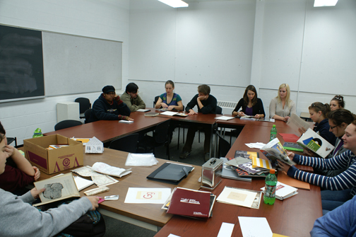
ART 435 group brainstorming session
Enter the men and women of CMU’s ART 435 Professional Practices in Graphic Design course. In early September 2010 the class had its first meeting with Janz. They knew that all the copy existed online, and that hi-res photographs would be forthcoming, but other than that they had to find their own way, since Wes was resolutely opposed to telling them what he wanted. This frustrated some of the students. “After all,” they asked, “Isn’t this a portfolio development course?” I tried to convince them that there’s no better way to develop one’s portfolio than by using someone else’s money to produce a project, but many remained skeptical. Then again, “How can you design for a guy who won’t say what he wants?” some lamented. To be fair to Wes, he had a pretty good idea what he wanted, and DID guide the students. But he was also interested to see how they would interpret the materials.
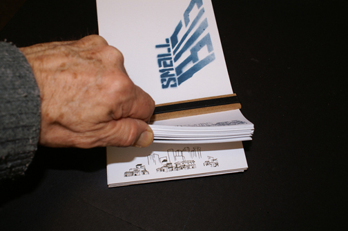
“Flip book” and cover logo
We set a deadline of late October for a finished design, a nearly impossible goal for a group of nineteen students to reach a consensus. We began with a group brainstorming process, an often slow struggle. We talked about unconventional alternatives to bound catalogs, things like card sets, poster fold downs, and boxed info kits. We discussed wrapping our ideas in portable materials like pocketed raincoats and grometted tents. This was, after all, an exhibition about low-cost alternatives to professional building practice. Unfortunately, with so many options available, some of the students began to despair.
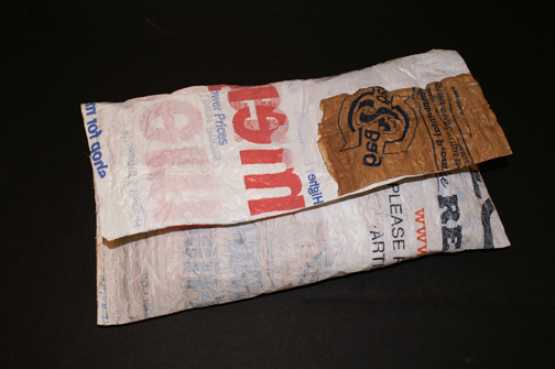
“Artifact 001”
Andrew Paquin focused our attention on a man who was making bike messenger shoulder bags out of recycled shopping bags. A couple days later, Allison Berels came to class with a small plastic pouch she had made by heat laminating plastic bags with her iron and stitching the material together. This became our starting point, dubbed “Artifact 001.”

“Artifact 002”
Our next task was to agree upon the format and binding structure of our printed piece. We prototyped several binding approaches including rings, posts, and nuts and bolts. Andrew Paquin and Ben Smith came up with a disassemblable prototype that could be rearranged by the viewer. At one point I’d casually snapped a large rubber band around a stack of cards. Once again Allison Berels appeared in class with a solution: a card stack backed by a masonite slab and bound with a rubber-banded masonite strip across the cover, the long-elusive “Artifact 002.”
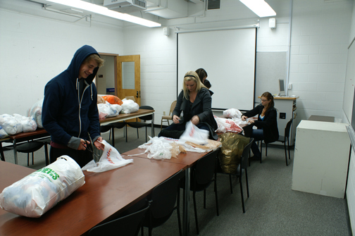
Separating and trimming bags
At this point we visited Chris Bradshaw at CMU Printing Services to ask questions, sample papers, and get quotations. If we used 50% PCW recycled paper and untempered masonite (the kind made without toxic binders) together with our recycled laminated plastic bags, we’d accomplish our goal of producing a formally designed but informal-looking object made, like the architectures it described, from re-purposed materials.
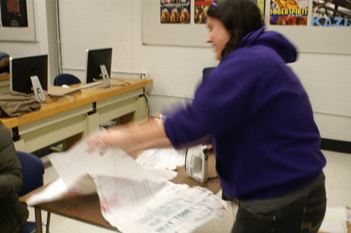
Amanda Rippin ironing bags
Throughout October the wheels of progress ground on. There were typefaces and color combinations to select. It was decided to combine the small architectures onto a full-color poster, and put everything else into three two-color chapters. The trailing edge (think binding), designed by Ashley Weiss and Jeremiah Britton, was to be a flip book of a favela expanding at the foot of a modern city. Jeremiah this time with Abby Peters collaborated on a custom designed “smallBIG” stenciled logo for the cover. Many other people worked on squeezing the extensive website copy into sixty-four one-sided 5″ x 9″ pages. It wasn’t easy.
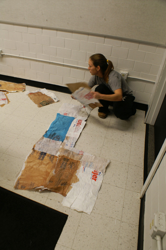
Allison Berels cutting laminated plastic “fabric.”
Meanwhile, across the hall from the computer lab, Allison had marshaled the group’s resources into a plastic fabric production facility. Recycled bags had to be trimmed, reversed, layered, and ironed into plats. These plats were then ironed into larger sheets, trimmed to finished size using a template, then sewn into pouches.
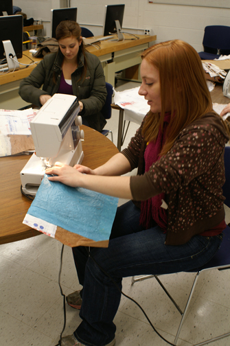
Amanda Wallace and Maud Ward sewing pouches
Early in November Wes Janz returned to view our progress and make helpful suggestions and corrections. With his blessing we finally took the project to press just before Thanksgiving. On November 30th, 37,000 pieces were delivered by Printing Services and the group set up a large collating mill. Over the course of two class periods we collated and bound nearly 600 sixty-page catalogs with a three-fold detachable poster. It was finals week and we were still sewing plastic pouches, but we had accomplished the impossible, a group-designed solution to an elaborate communication problem that’s both visually interesting and true to theme.
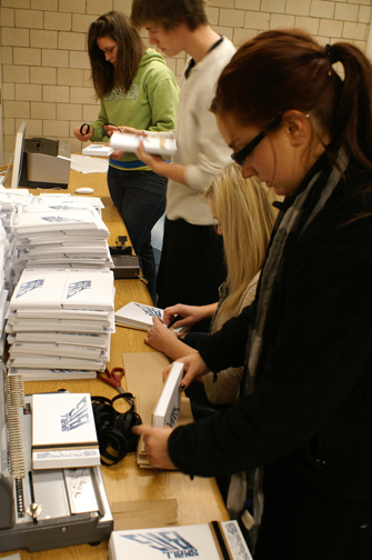
Ashley Hehl, Andrew Paquin, Katie Klumb, and Jessie Schauer binding catalogs
Many thanks to Wes Janz for the opportunity, to Chris Bradshaw at CMU Printing Services for the helping hand, and to the students of ART 435 for their sincere efforts in reaching our goal. For the expanding life of the small architecture traveling exhibit there’s a catalog worthy of the show. You have proved that sometimes onesmallproject needs the hard work of one large group to achieve success.
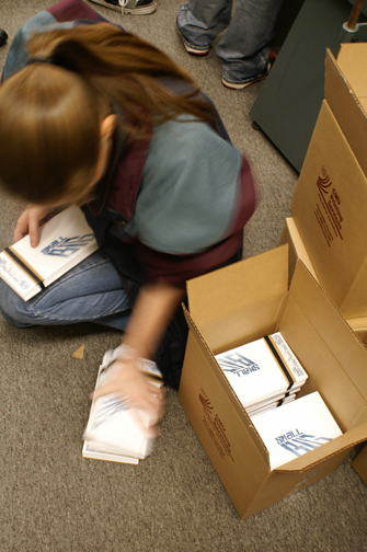
Stacie Budek boxing catalogs
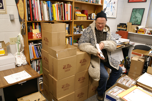
Satisfied customer Wes Janz with press run and pouches
David Stairs is the founding editor of Design-Altruism-Project






December 16, 2010 at 9:50 pm
Wonderful to see it come to fruition! I miss the days of sitting in a group brainstorming session with creative minds abound. Great project for a great cause.