David Stairs
Ask a group of student designers, any group, to develop a campaign while working in a large cohort, and they’re likely to react the way my Central Michigan University students did when I first made an unconventional proposal to them back in November 2012. I asked them to consider developing an online fundraiser for a rural African community-based organization. “This is our degree exhibition,” they replied. “How will we get any portfolio work out of this?” they asked in all seriousness. It was a predictable if callow reaction, one young designers are almost programmed to make by years of priming for local competitions through portfolio development courses.
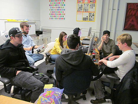
Student brainstorming session
In this instance, I was rescued by a most unexpected turn of events. In December the class met again and, this time, their response was enthusiastic. “What happened?” I asked. As it turned out, the colleague who teaches our portfolio development course had taken these students on a series of agency visits, and the more forward members of the group had presented the professionals with their dilemma. They were faced with a difficult choice, they said. They could hang their portfolios for the thesis show, or they’d been given the opportunity to design a crowd-sourced fund-raising campaign for an African non-profit. I don’t have to tell you what the professionals said.
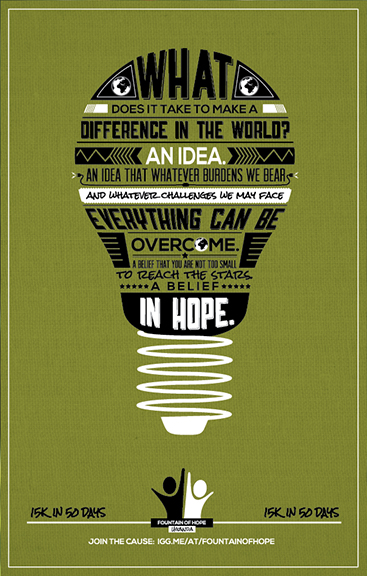
Fhope Fundraising Poster
By January all but three members out of a class of two dozen had signed on to the project. What ensued, three months of coaxing, headbanging, hand-wringing, and hard design choices, is testament to what people can do when they focus their collective eyes on the prize. After several presentations introducing the class to our Ugandan client, and the artifacts, social mores, and building styles of Uganda, they jumped in feet first and were on their way. None of us had ever attempted such a project before. This would be a classic instance of sink or swim.
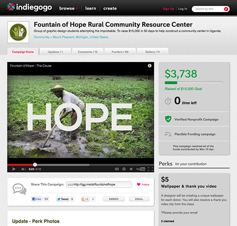
Indiegogo crowd-sourcing site
One group volunteered to face an immediate stiff deadline and create a two-minute YouTube video to be placed on our campaign splash page. We started by looking at the lovely video developed for the ill-fated University of California new logo launch. The group mustered their combined expertise in story boarding, copy writing, video editing, and animation, coming up with a short piece entitled The Cause, which launched on February 24th. Accompanying this were an Indiegogo site, a Twitter feed, and a variety of other initiatives including an Etsy account, a QR code, and some online advertising that drove thousands of Africans to our Facebook page.
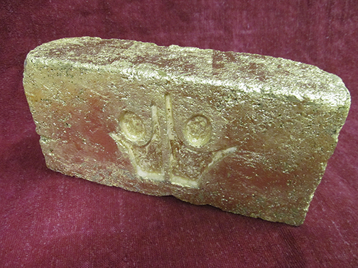
Branded 18 karat gold leafed brick as $1,000 giveaway
Meanwhile, a second group was working up a series of perks and giveaways that are the mainstay of such online fundraisers. They came up with hand-printed posters and postcards, T-shirts, stickers, and a bracelet that was pretty popular. They also developed banners and print collateral for the April thesis exhibition. They even branded a brick with our client’s logo, an artifact that became a functioning symbol for our rural community resource center project.
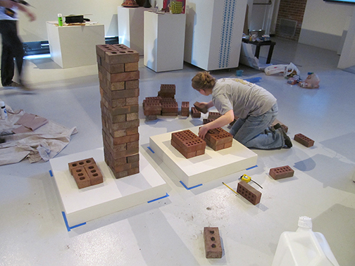
Installing the exhibition
By mid-March, with the show opening looming on the 29th, the third or installation group swung into high gear. These folks had had the longest time to plan, but that didn’t make their job any easier. Coordinating the look of an exhibition that was as much about anthropology as design would’ve been a challenge for museum professionals. My students accomplished the task by a variety of clever means. They introduced viewers to everyday Ugandan artifacts, provided Human Development Index statistics, presented the client in his own words, created a video viewing room, used a jerrycan as a barometer of giving, and even set up a donation station from which many people chose to join the campaign during the course of the show.
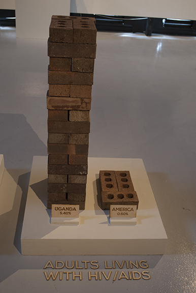
Human Development Index Stats: percentage of HIV+ in population, Uganda:America
The Indiegogo campaign’s 50-day duration ended April 15th. We did not reach our ultimate goal. When you stop to consider how many groups are asking for donations, from PBS to the neighborhood child cancer case, you realize how hard it is to raise money if you don’t have a new electronic gadget like the Pebble as a giveaway. But we did raise nearly $4000 for our client. We accomplished this in the context of a class designed to show off student abilities conventionally devoted to fantasy projects. The students worked in a spirit of cooperation that was every bit as effective as any competition, with no one taking personal credit for the products of a group effort.
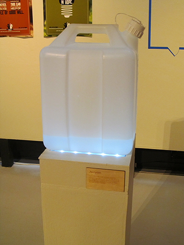
Jerrycan donation barometer
The participating students who were interviewed by both print and broadcast media during the course of the campaign expressed gratification that they were involved in something greater than themselves. Several have mentioned that they gleaned more from the undertaking than mere portfolio pieces, citing project management skills, crowd-sourcing, large team design experience, as well as a better understanding of the not-for-profit sector.
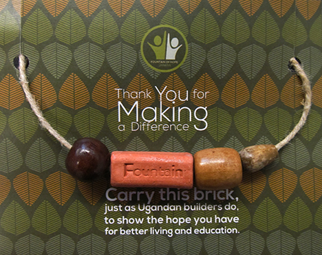
Fountain of Hope “Brick” bracelet
Was it a stressful semester? You bet. We had no road map and often did not know where we were going to end up. This is a hard lesson to learn, especially for designers who generally like to feel in control. But, as in life, uncertainty about one’s destination is a poor reason to avoid setting out on a journey. Twenty-one students took the plunge. No one drowned, and they all wound up somewhere far downstream of the jump-off point, better able to navigate life’s rapids. Congratulations guys, and thanks for proving that my faith in you was justified.
David Stairs is the founding editor of Design-Altruism-Project





Leave a Reply
You must be logged in to post a comment.