Carter Scholz
In the prehistory of personal computers, Lee Felsenstein and some others created Community Memory in Berkeley in 1974: a publicly available teletype terminal, connected to a mainframe computer via 110-baud modem. Users could post and read messages at a few different sites. Felsenstein had read Ivan Illich, and he saw this as a tool for conviviality. It was a novel vision in a time of monolithic mainframes: computers as liberating and empowering, both personally and socially.

Lee Felsenstein / Courtesy Lee Felsenstein.com
Felsenstein was a member of the Homebrew Computer Club. So were Steve Jobs and Bill Gates, and a less convivial pair is hard to imagine. Gates was naked in his pursuit of profit above all. Jobs was cannier, but no less single-minded. He sold through Apple a funhouse image of Felsenstein’s vision of personal empowerment and conviviality that was, starting with the Macintosh, starkly at odds with the reality of Apple’s product design.
It is striking, how conviviality got stood on it head, so that today Felsenstein is largely forgotten, and Jobs is celebrated as a philosopher-king of innovation, and hero of the people. Jobs and Apple pioneered this down-is-the-new-up marketing move in the tech business, which is now the standard model, in which the very words “friend” and “social” have been redefined to create a profit stream from the sale of users’ personal data.
WHAT IS DESIGN?
Time magazine, in their issue memorializing Jobs, claimed that his key insight was that “design is more important than functionality.” Well, no. Design is functionality. But for Time, “design” means appearance. So they’re right: Jobs was most concerned with appearance. With coolness.
Coolness is about being noticed. Good design is transparent. Many news sources published a timeline: photos of Jobs across the years with his cutting-edge products, from the Apple II to the NeXT to the iPad. (The intrusive capitals tell their own story about getting noticed.) Every photo dates to the year, possibly to the month, by what Steve was wearing, and how the products looked — like Hollywood hairstyles, from Farah Fawcett on. Remember candy-colored iMacs?
Jobs never cared about computers per se. They were cool, and that got his attention. His insight was that computing and appliances were converging — must converge, if a large consumer market for them was to be sustained. So he would facilitate that convergence.
On the strength of this convergence, Apple went from being a fringe player in the personal computer market to being the most profitable company on Earth. This did not come by selling computers. Apple’s share of the computer market was never higher than 10%. Today, computers account for between 9% and 13% of its profits, and Apple sells about 7% of the world’s computers.
Apple’s products were directed at the untechnical “rest of us” — a slogan that ironizes Apple’s elite appeal — and that difference had to be signaled foremost in their appearance. Jobs studied upscale appliances for inspiration. Some unkind but perceptive commentators called the first Macintosh a toaster.
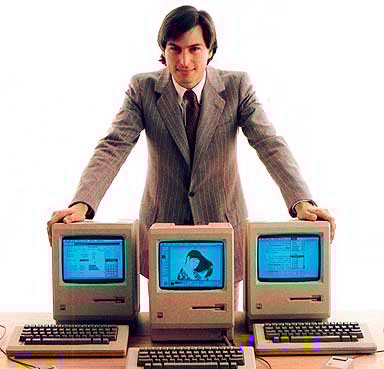
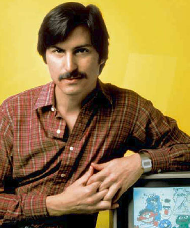
Steve Jobs and his “toasters”
LITTLE DIETER NEEDS TO FLY
Dieter Rams, the legendary industrial designer for Braun from 1955 on, was made much of by Jobs, and by Apple’s current chief product designer, Jonathan Ive. (Ive overtly borrowed Rams’s designs for devices such as the iPod — specifically the 1958 Braun T3 transistor radio, the original portable music player.) Here are a few things Dieter Rams said about design which Apple never heeded:
“Good design emphasizes the usefulness of a product whilst disregarding anything that could possibly detract from it.”
“It avoids being fashionable and therefore never appears antiquated. Unlike fashionable design, it lasts many years – even in today’s throwaway society.”
“Care and accuracy in the design process show respect towards the consumer.”
Here’s something Steve Jobs said about design: “People don’t know what they want until you show it to them.”
Jobs was a consummate salesman. But what he did had nothing to do with design, and was in large measure opposed to it.

Braun T3 transistor radio by Dieter Rams
INNOVATION AND ITS DISCONTENTS
A computer is Protean. It can serve as an adding machine, a drafting table, a typewriter, an atlas, a communicator, a navigator, a simulator, a jukebox, a movie theater, and many things not yet imagined. So it presents a particularly broad, perhaps intractable, set of design problems. Apple’s engineers once addressed these problems. Apple Human Interface Guidelines, an early internal document, is a benchmark of good thinking about the many problems of the computer interface, but that document has been largely forgotten by the 21st century Apple.
Also, the market pressures of the tech industry are inimical to good design. Products must ship, the sooner the better. Software can always be upgraded or fixed in the next rev. This means there is no final product, thus no fixed design parameters. Coders under pressure are skilled precisely at finding ad hoc solutions, or “neat hacks” to reach immediate goals.
One such goal was Job’s insistence on including a variety of type fonts in the Macintosh. And because of this inclusion, for a brief window of time, Apple had one significant captive market: desktop publishing. The combination of Apple’s graphical OS and their licensing of Adobe’s Postscript for laser printers made the Macintosh from 1985 through 1992 (until the release of Quark XPress for Windows) the only practicable solution for computer-based graphic design.
Yet any graphic designer who ever used a Macintosh can tell horror stories about its font management. The Mac team hadn’t the time or the experience to do it right. Its bit-mapped “neat hack” implementation was useless for professionals. Adding Adobe’s better-designed “printer” fonts on top of the screen fonts made the original hack usable, but also more complex and unreliable. (And expensive. The original Apple laser printer sold for $7000, about half of which was Adobe’s licensing fee for Postscript.) Thirty years later, because the foundation is shaky, there are still problems. Adobe’s OpenType font format claims to address the problems; yet it too already exists in many versions and revs; the only sure result is that professionals have to buy their fonts all over again in the new format. That OpenType was developed jointly with Microsoft doesn’t promise enthusiastic support from Apple, which feuds with both Microsoft and Adobe.
Typography is an exceedingly intricate field, with many subtle challenges. No one at Apple knew enough even to ask the right questions. And it was the last thing on Jobs’s mind that his fonts be useful. They were just cool. Nobody else had them. This was accidental bad design. In other cases, Apple intentionally took decisions directly against user interests.
HARDWARE EXCLUSIVITY
A motto of early cyber-utopians like Felsenstein was, “one user, one CPU (central processing unit).” This attacked the IBM model of mainframe computing, which rented one CPU to all users. You couldn’t buy an IBM mainframe; you rented the system, and the technicians who ran it — terrific for IBM, less so for users. Felsenstein’s ideal of “personal” computing was going to change all that by putting a computer on every user’s desktop, wholly under that user’s control.
Through the 1970s, despite modestly successful upstarts like DEC and Wang, IBM dominated computing, but personal computers were a rising threat. IBM had a reputation and a culture, acquired through its mainframe years, of rigid hierarchy and control over every detail of its operations. Someone at IBM was smart enough to know how poorly this reputation played to the growing personal computer market. So IBM created an autonomous group, based in Boca Raton, Florida, to design their first PC.
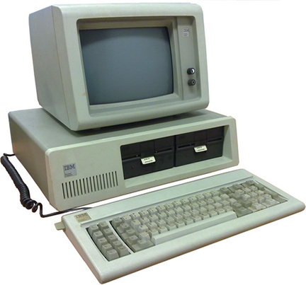
IBM PC 1981 / Courtesy of Wikipedia
In 1981 this group released — startlingly, for IBM — an open system. The IBM PC was modular and expandable by design. You could add memory. You could add third-party extension cards. Very soon you didn’t even have to buy the computer from IBM; there were plenty of third-party manufacturers who copied the PC’s open design. These vendors cut deeply into IBM’s market share, but the openness benefitted users and caused the overall PC market to expand much faster than Apple’s market.
At that time, Apple’s cash cow was the Apple II. The IBM PC was a direct threat to it. The Macintosh was Jobs’s answer. His first salvo was the famous “Big Brother” 1984 Superbowl ad, directed by Ridley Scott, that introduced the Macintosh. It was a triumph of image over substance. It played the image of Apple as a company of young rebel upstarts against the familiar image of IBM’s gray oppressive dominion.
Yet if you examine the two competing PCs, you find that exactly the opposite was true. The first Macintosh was in every respect more closed, paranoiac, and mistrustful of its customers than the PC. It couldn’t be expanded at all. You couldn’t even open the case without a unique tool available only to Apple dealers. All peripheral equipment — the monitor, the keyboard, the mouse, the floppy drive, the printer — though unextraordinary, were sole-sourced by Apple, and were designed to be incompatible with any other computer. The monitor was built-in; the mouse and the keyboard communicated via the “Apple Desktop Bus;” the floppy drives were standard Sony issue, but used a unique Apple formatting scheme.
Apple’s business plan was exactly like the old IBM: they sold you the hardware and the software and the service, and you couldn’t go anywhere else for anything. It’s fitting that Jobs later hired Paul Rand, the designer of the iconic IBM logo, to create the logo for his short-lived NeXt computer.
The added expense of Apple hardware, so its exterior trim signalled, was for superior craftsmanship, functionality, durability. But Apple’s parts came from the same factories as every other maker of consumer electronics. And their quality control was in no way superior. The luxury surcharge was for prestige alone. It bought nothing in performance or reliability.
The IBM PC, improbably, got it right: a computer is Protean, so a good design entails making it as open as possible. That means interoperability across systems: conviviality.
SOFTWARE EXCLUSIVITY (Does Not Play Well With Others)
Many of Apple’s software design decisions were intentional barriers to the interoperability of Apple machines with other computers. From the beginning, the Macintosh OS was non-convivial by design, in ways as numerous as they were petty.
Apple chose to make its end-of-paragraph marker in text files a single carriage return (CR), rather than adopt either the existing Unix standard of a single line feed (LF) or the DOS standard of a CR-LF pair. There was no technical need for this. It was difference for the sake of non-conviviality.
For audio files, Apple created the AIFF format. Again, this offered the user no advantages over existing formats, but served Apple as a further tool of exclusivity. When OS X came out, the AIFF format was modified again, reversing its bit order, creating more compatibility headaches even for long-time Apple users.
Because of its unique floppy drive, from 1984 to 1991 Mac disks were unreadable by any other computers, and vice versa. From 1991 to 1994 you could launch a third-party utility to do so, which still couldn’t address high-density floppies. For the entire ten years, Apple acted as if this was not a problem.
Floppies are long dead, but Apple’s spirit of exclusivity survives. To this day, when any removable drive is plugged into an Apple OS X computer — including thumb drives and camera cards — OS X immediately writes hidden files and directories onto the guest disk, potentially damaging it. As one commentator observed (at hostilefork.com), “Apple’s choice to do this is incredibly self-serving and shameful.”
Apple’s long-ago choice to divide its files into two parts, one for “data” and one for “resources,” was usually transparent to solitary Mac users, but it caused grief for any user trying to share or email files to non-Mac systems. Why would you want to do that? This division is gone in OS X, but it has been replaced by invisible “metadata” files that serve the same purpose, leading to some unpredictable behaviors even on a single Mac.
OS X’s Spotlight is a file search-and-retrieval tool. By default, Spotlight reads and indexes every single file on every disk ever attached to the computer. Consider that a brand-new install of OS X, out of the box, holds over 500,000 files, before you’ve actually done anything with it, and you’ll understand why so many users complain that it’s impossible to use the computer while Spotlight hogs the CPU to do its thing. If you know how, you can modify this behavior by excluding items, but Spotlight’s default is to grab and own whatever it touches. It, too, writes invisible files. It, too, has a third-party, superior replacement.
OBSOLESCENCE
At the heart of every computer is the boot ROM. This chip records some bare essentials about the system. It tells the operating system (OS) how to connect to the hardware it’s attached to. The OS itself loads from an external disk drive.
In a non-Apple machine, the boot ROM was typically about 4 kilobytes of code. In the first Mac, ROM was 64 kilobytes. By 1998 ROM had ballooned to 4 megabytes. It was so big because it contained many important core routines that were part of the OS. By separating so much of the OS onto a physical chip soldered into the computer, Apple ensured an extreme degree of dependency between its hardware and its software, and made the production of third-party clones — the thing that had compromised IBM’s PC market share — next to impossible.
Interestingly, from 1995 to 1997, while Jobs wandered in the desert of NeXT, Apple did license their all-important ROMs. For that brief time, companies like Power Computing, Umax, and Motorola built Mac clones that undersold and outperformed Apple’s own hardware. This gained users for the Mac OS, but Apple’s hardware market share in the domestic PC market dropped from 10% to 5%. That number of users had decided that Apple’s hardware was inferior. When Jobs returned to Apple in 1997, he stopped the licensing. He was absolutely right that Apple couldn’t compete on performance alone.
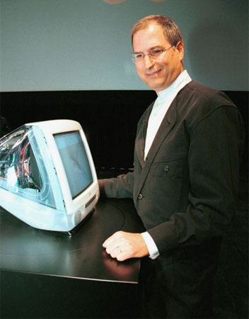
Not even the candy-colored iMac could reverse Apple’s slide in the computer market
This tight interdependence of the OS and the physical computer also ensured that software or hardware could be made obsolete by fiat. To stay current — to stay functional — in Apple’s closed world has significant costs. If you bought all the OS X system upgrades from 10.1 to 10.8 you spent about $1000; you also had to buy a new computer at least once.
You can resist this pressure to upgrade, but not if you must run the latest version of something, or if you own other Apple devices. Buy a new iPod, for instance, and you’ll need the new version of iTunes, which needs the new OS, which might require a new computer. “Backward compatability” is a design specification that can be honored or not. The decision not to honor it is taken against user interests. It used to be called “planned obsolescence.”
The “upgrade” process thus turns design principles upside-down; its main purpose is to gain revenue, while maintaining a product in a less-than-ideal state somewhere short of complete dysfunctionality. It’s not unlike a broker churning a client’s account.
Even at the most basic level, Apple routinely makes unnecessary changes in connector types, ensuring that pedestrian items like cables and power supplies have to be re-bought over and over, at Apple markups. Users of iPod, iPad, and iPhone are unhappily familiar with the Lightning connector that obsolesces their old 30-pin dock connector, and any accessories that happened to be with it. But no worries; you can buy a Lightning-to-30-pin cable for $39 at the Apple Store; however, because it contains active circuitry, it’s hard to clone, and Apple charges a certification fee to third parties who want to try. Buyers of the iPhone 7, which suddenly lacks a headphone jack, will need to buy wireless headphones from Apple, for $159.
One dirty little secret of the iPod (and many other devices) is its built-in, non-replaceable lithium-ion battery with a shelf life of three years. You can pay Apple $49 – $79 to replace it. Or you can buy a $14 replacement battery and learn how to do it yourself at ifixit.com, which comments, “Difficulty: Very difficult. Apple designed their new iPods to be very difficult to take apart without destroying major components.” If you do send it to Apple, read the fine print: “Your replacement iPod may have a newer version of the operating system (iOS). As a result, you may also need to update your App Store apps for compatibility with the newer iOS.” Which may become surprisingly expensive, to maintain compatibility across all your Apple devices. The iPad and iPhone also have non-replaceable batteries, so that would be three expense landmines, not counting your computer or your Apple Watch, the battery of which runs down after 18 hours. Don’t stay up too late!
The latest version of the Mac Mini ships with its RAM soldered in; it’s not expandable. The amount of RAM is a strong determiner of system performance; Apple computers have always shipped with the bare minimum needed to run the OS. You can pay Apple’s markup for the maximum, and/or count on early obsolescence. These design practices are consistent with the days of the original Mac, when Jobs repeatedly vetoed user expandability. As engineer Andy Hertzfeld put it decades ago, “He would rather have them buy a new 512K Mac instead of buying more RAM from a third-party.”
CUI BONO? WHY IT MATTERS
Controlling the OS and the hardware is not enough: the App Store, presented as a convenience for users, gives Apple total control over its devices’ monoculture. Every app is screened and approved by Apple, making the software ecosystem in effect a gated community. The only way to get a third-party non-authorized app on your iPhone is through a process aptly called “jailbreaking,” which voids your warranty. So is it really “your” iPhone?
Of course, Apple merely blazed this trail. The very word “design,” in Silicon Valley, has become synonymous with a closed system under absolute diktat of the manufacturer. Android users are only slightly less in thrall to Google, or Windows users to Microsoft, both of which push unneeded upgrades onto your devices at every opportunity. By default, Windows 10 records everything you do — every keystroke, every mouse click, every app, every website — and sends that information to Microsoft; your Android phone tracks your location and sends it to Google.
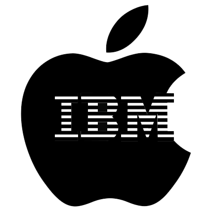
So, curiously, or not, we’ve returned to IBM’s original business model. Under this model you own nothing; you subscribe to everything. You don’t own CDs, you use Spotify. Your iTunes library is secured by DRM. You don’t own books, you have files on your Kindle — which is effectively owned by Amazon, since they have access to update it, or wipe files, or disable it (all of which they have done), while you, the owner, don’t have such access. You don’t buy or own Adobe software; you pay a monthly fee. Your data is stored on other people’s servers (then mainframes, now the “cloud”), which may or may not be reliable or secure. Your email passes through servers where it’s all read by algorithms and sold to advertisers and other entities. Your phone is a tracking device with a live microphone and camera, even when it’s turned off. Logs of which websites you visit are kept on your provider’s computer, not yours. Your devices obsolesce so quickly they might as well be rented. Are there good design reasons for any of this? Does it benefit the user? It positively benefits the rentiers.
The user benefits in strictly limited ways in the short term. For most users that’s enough; their lives are too busy to spend time or worry penetrating the complexities of all this tech. But this opacity, not accidentally, contributes to this very situation. The model intentionally undermines user autonomy, it incidentally undermines sound design principles, and it ultimately undermines the integrity of the culture built around it.
Design is problem solving. Sometimes the problem is simple — selling things. That’s true of book covers. Interior book design is a much more rigorous task, because that’s where the real use goes on. When revenue comes first, real-use problems aren’t being solved.
Design is critical thinking. When there’s confusion about design — when you can’t tell an honest attempt to solve a real problem from an attempt to paper it over, or redirect to a false problem, or increase revenue — when you can’t tell a real need from a manufactured want — the con wins, and critical thinking is lost.
In the last century we jerry-built, without conscious design, a culture centered around the automobile, making the car omnipresent and indispensable, and with it our fatal hunger for oil. The unintended consequences affected our landscape, our economy, our politics.
In this century computing has created around us another such ad-hoc and inescapable world. Because the computer is Protean, it affects even more aspects of life than the automobile: our financial system, our infrastructure, our national and personal security, our privacy.
The last thirty to forty years in Silicon Valley have seen the evolution of a maverick ethos that began in user-centrism, passed through vast capital accumulation, and continues as a monolithic edifice of management and maintenance. This has brought diminished autonomy for users. Exercising control of one’s technology is increasingly discouraged, disadvanatged, and in some cases outlawed, with the trend toward more control by vendors and more penalties for users. (The Trans-Pacific Partnership and other pending trade deals contain intellectual property clauses that permit statutory damages when digital locks are circumvented even for private purposes or personal use. This could result in criminal penalties for individuals who copy material from CDs that they own, or even for jailbreaking a device they own.)
So it is finally a political issue. It represents a choice between autonomy and virtual serfdom, between conviviality and dictatorship, benign or otherwise. Design principles, which is to say designers with principles — principles that favor the broadest real-use benefits for users, user autonomy, and conviviality — stand as the first line of defense against the abuse of monopoly power over the the end user.
It’s also worth noting that “problem solving” begins with problem setting. Because the computer is Protean, its problem set is almost infinite. Software and hardware designers decide which set of problems computing will address. In the early days of personal computing, the largeness of this set was a playground of possibilities for designers and engineers. As they return to the model of maximizing revenue for the monopolists and monopsodists, following Jobs’s dictum that users “don’t know what they want until you show it to them,” users will have to assert their autonomy or lose it.
A Luddite is understood to be a technophobe, an illiterate, a troglodyte. But that’s wrong. The textile workers who smashed the Jacquard looms were knowledgeable and technically skilled; they understood exactly what was going on in their workplace. As Eric Hobsbawn writes, “where the change did not disadvantage the workers absolutely, we find no special hostility to machines.” They opposed not the technology per se, but the link between that technology and the capital controlling it; they understood that the technology was being used to extract livelihood from them, for the benefit of the owners. It’s time to reclaim the proper meaning of the word, and for all of us to become practicing Luddites, to ask of our technology and the world it enables: who benefits most? and to act accordingly.
Users and designers have to be on the same side, if design is to mean anything, and if we mean to have a world where serious problems are set and solved — including problems of survival — rather than monetized, managed, and maintained.
Carter Scholz is a novelist and composer who has worked with computers since 1981.

