
David Stairs
There are two or three things graphic designers are especially keen about. They like to make logos: Researching, executing, and branding a marque will cause most self-respecting designer’s hearts to flutter. They like to talk about type: Obsessing about letterform and the way it looks on the page and interacts with images is second nature to them. And they like to illustrate data: In fact, they have an almost childish glee for finding ways to interpret statistics in a playful manner. But designers are not the only ones who represent data, and because it is not their exclusive domain they need to better understand why this is so.
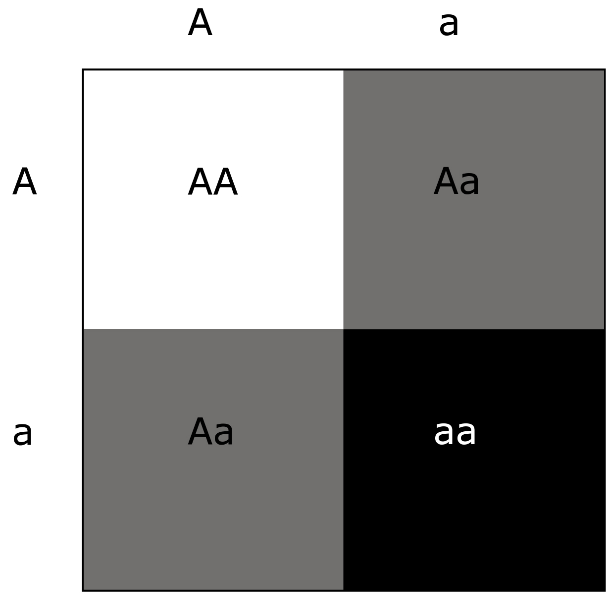
A Punnett square, demonstrating heritability of dominant and recessive characteristics after Mendel.
Scientists also represent data visually. In fact, efforts to visualize their findings are so fundamental to the practice of science that scientists have developed an uncanny knack for it. This ability is not necessarily grounded in artistic training, and can result in something very basic, like Punnett’s square used to depict Mendelian genetics. But, although they ordinarily do not have training in visual art or design, scientists often invent new and innovative ways of visualizing; think of Sturtevant’s representation of genetic markers on chromosomes. This process is often a combination of what the data itself suggests enhanced by incremental improvements added by members of the scientific community. A graphic that follows the inherent logic of the substance represented is more likely to be universally accepted. This endeavor, the communal undertaking of a universally agreed upon meme or method, guarantees that visual ideas will be taken and improved upon, so long as they are effective.
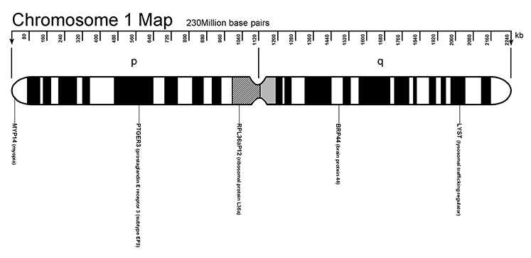
Map of Sturtevant’s Chromosome 1 with the location of five of its approximately 4000 genes represented.
This is where much data-driven work by designers dramatically differs from that of scientists. There is an inherent difference in the words the two disciplines use. Designers call their visualized data info-graphics, or graphics that inform. For scientists, the proper term is informatics, meaning the collection, retrieval, and analysis of information. They sound similar, but there’s a subtle difference. Informatics is based on hard data; infographics, often rhetorical, treats visual data as a metaphor. And there’s one other difference: although infographics is in common parlance among designers, it does not appear in the dictionary. In other words, it’s informal, a colloquialism.
Cam Wilde by way of Google
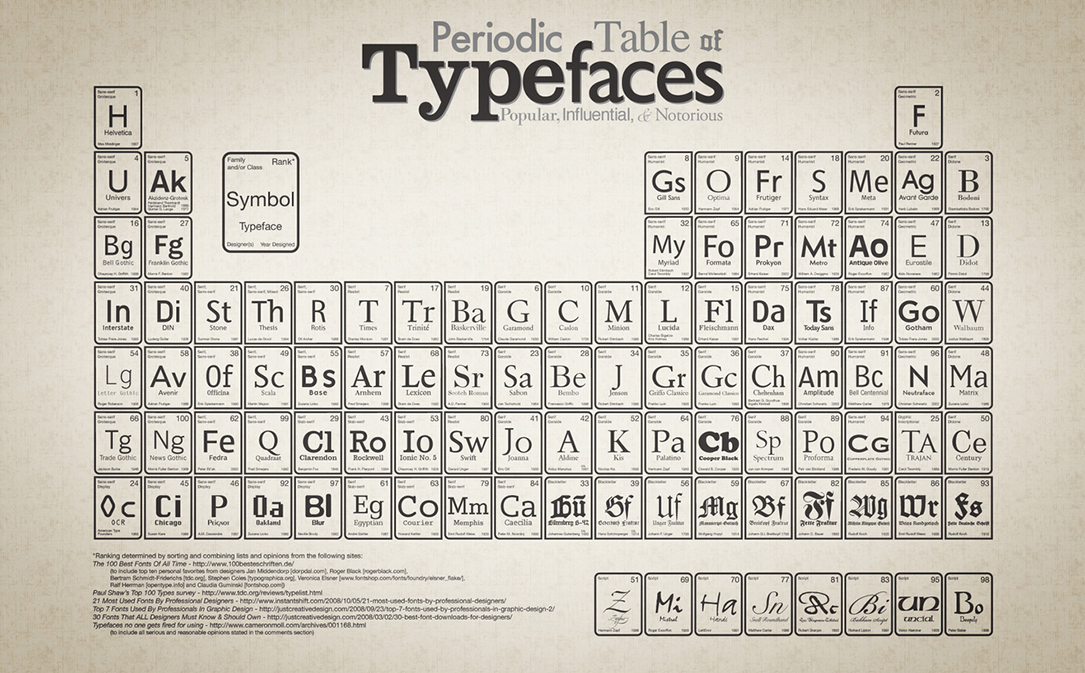
The inherent need to entertain or persuade that is so common to most infographics makes them more relevant to a New Yorker cover than a PLoS conference paper presentation. Just as the world has adopted Milton Glaser’s I Heart NY creation, or Henry Beck’s London Underground map, applying them in a hundred variations, so too have designers colonized the style of hard science. Take Mendeleev’s table. First developed in the 1860’s, the vision of a means to order the physical elements according to their atomic weight was so far-seeing that it anticipated yet undiscovered elements. Today, the concept is so frequently copied that there is a Periodic Table for everything from candy to typefaces, until we reach the ultimate in self-reflection, a Periodic Table of Periodic Tables. The purpose of such non-scientific undertakings is sometimes humorous, other times persuasive. But in a world in need of as much accurate depiction of data as possible, a clear distinction between data representation and data free-interpretation needs to be emphasized. Probably some of the finest examples of scientific visualization have derived from bioinformatics over the last century. Thanks to gene sequencing, and other techniques of molecular biology, scientists have had to develop a visual vocabulary for understanding life’s building blocks. Some, following Sturtevant, have created horizontally overlapping, nested representations of the known genes. Craig Venter’s genome, available as an 88MB PDF file of a 40″ by 60″ poster, has been called “the most complex informational graphic of all time.” As you can imagine, mapping all 25,000 genes comprising the 3 billion base pairs is an enormous task, and gaps remain. I provide only the minutest fragment of the Venter Map here.
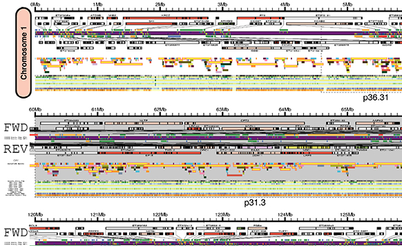
Detail of Craig Venter’s genome. Reproduced by permission, J. Craig Venter Institute, under a Creative Commons license from PLoS Biology.
Another approach scientists use is an alternate method for visualizing smaller genomes. By nesting concentric circles, Professor Eric Linton maps the much simpler genome of a cytoplastic organelle such as a chloroplast. Technically, one “reads” the outside of the circle, the hydroxyl DNA strand, one way clockwise and the inside, or phosphate strand, in the opposite direction. While such details may not be inspiring to a layman, they are minutely informative, telling an experienced viewer what he/she needs to know at a glance. Again, the difference between data-driven graphics that are meant to amuse and those that are in deadly earnest becomes crystal clear.
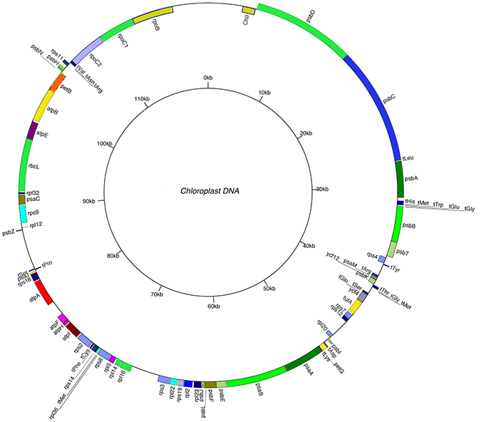
Courtesy Eric Linton, Central Michigan University
Most visual designers are familiar with Edwin Tufte’s The Visual Representation of Quantitative Information. It should be required reading for every design student. Tufte’s illustrations of historical graphics like Minard’s depiction of Napoleon’s Russian campaign in terms of casualties, or Maray’s train schedule graphically depicting morning and evening/local and express arrivals and departures are early examples of data representation. Citing visualization techniques from data maps to computer modeling, Tufte chooses to argue that successful data visualization is a matter of clarity and simplicity, and these words are the same ones universally used by instructors of design to critique their students’ work. Accuracy should be added to the list. By contrast, third year graphic design infographics at Central Michigan University lean heavily in the direction of rhetoric. This might seem ironic coming from students who are usually not required to study persuasive methods. Rather, Graphic Design students learn compositional basics such as field/ground relationships, color theory, and visual hierarchy. Consequently, their data visualization works to be clear and informative, and this would please Tufte. But in keeping with the tenets of journalism and advertising, which is often the only baseline students have, the work also strives to be visually persuasive. Generally, students are forced to present an incomplete or superficial understanding of the data. With a more scientific approach to data representation among design instructors, students could learn to balance pleasing imagery with hard fact.
 Courtesy Rachael Jerzowski
Perhaps designers and scientists will one day spend more time working together. After all, there is no inherent obstacle to making data visualization both entertaining and accurate. There has always been interest in scientific visualization among artists and designers. I think here of colorized NASA photography, or Roman Vishniac’s Building Blocks of Life, and Felice Frankel’s Envisioning Science. These examples are photographic, yet they point the way toward a future of science accurately represented by design. Just as web designers can benefit from understanding the programming language that underpins their layouts, information designers can also benefit from interpreting data in a more rigorous, less fanciful manner. Scientists will go on, much as they have for the last 300 years, naming and categorizing the known universe, revealing to the best of their ability all that is hidden behind the veil of nature. Making their data visually compelling as well as accurate need not be a topic strictly for scientists, but can and should be taken up by future generations of scientifically literate visual designers. A longer version of this essay appeared in DesignIssues Volume 28, Number 4 Autumn 2012 as The Visual Representation of the Human Genome.
David Stairs is the founding editor of Design-Altruism-Project.


Leave a Reply
You must be logged in to post a comment.