Malika Soin
The title of this essay is inspired from Gabriel Garcia Márquez’s magical realist short story, “Light is like Water.” In the story, through textual narration, the reader visualizes the transformation of an everyday apartment setting to a sea world with floating objects. The realistic function of light is to brighten up a space but Márquez writes about the light from broken light bulbs drowning the apartment and submerging the objects. He also introduces floating and flying objects at the same time: a shawl flutters like a bird and floats in the apartment like a golden manta ray. He transforms mundane household objects into magical entities. In an attempt to create objects that fly and float using the tools of graphic design I chose three familiar objects from Indian culture. In literature, words are used to describe different aspects of everyday reality, revealing even the most obvious elements in a new light. In design the visual tools namely form, shape, color, and type are used to perform the above stated function. These objects are chosen as a result of the nostalgia experienced due to my displaced cultural context from India to Canada.
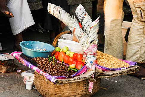 A street vendor selling food in paper cones in India
Paper Cones
Paper cones are conventionally made out of discarded newspapers and are used as a “make do” utensil by street food vendors in India. To a native Indian, eating out of a paper cone brings back memories of eating street food. The object is not only an ingenious money-saving strategy by a vendor but is also an environmentally friendly option as the paper is reused before it is recycled. The ingenuity of objects like the paper cone often goes unappreciated due their ubiquity in day-to-day Indian life. In order to draw attention to cultural practices associated with a paper cone, a rediscovery of the object is made. The desired aim is achieved by investigating the context in which the object exists along with the object’s formal qualities. The context for a paper cone is the streetscape of India, which is an amalgamation of local and global visuals and practices. From vendors occupying streets in front of the shopping malls to the never-ending traffic on roads, it is easy for a paper cone to get lost in the chaos. Its materiality does not command attention from viewers since the practice of eating from a paper cone is naturalized. As a result, the user discards the object after it fulfills its purpose. For a paper cone to be valued as a cultural object it needs to be perceived as something that is precious, rather than disposable; a thing of physical or emotional worth. In Indian culture, “preciousness” as a material quality is predominantly associated with metals such as gold and silver, ornamentation and money.

Altered Paper Cones
The altered design uses laser cut Indian motifs as elements of visual ornamentation, endowing a cone with value. The materials used to create them are silver and gold toned papers, handmade and colorful papers, and even real Indian currency. The motifs are repeated to create patterns that are laser cut on the new papers. They not only function as decorative visuals but also transform the respective papers. The patterns perforate the paper, which is then shaped into a cone. Retaining the basic structure of a cone and manipulating its materiality and visual appearance puts the viewer in a conflict due to the blurred distinction between its status as a purely functional everyday object and a uniquely designed artifact. This cone then performs an altered function; it is not only a utensil but also an ornamental object worthy of appreciation. As these cones now replace the conventional paper cones, their interpretation challenges their conventional perception as unimportant objects. The reconstructed paper cone provokes thought and engagement; a rediscovery of the original object. Interacting with these unconventional objects starts a discourse on the perception of everyday objects and what is recognized as or deemed valuable in a culture.
Paper Soap
The visual transformation of an Indian paper soap package is titled Pigment. The particular soap strips investigated here are an example of a commonplace design found in everyday Indian culture. The paper soap is used when traveling, owing to its compact form and dimensions. The Indian marketplace is saturated with skin-whitening products that are applied on skin, such as creams and soaps. A user is made to believe that the frequency of their application on skin is related to the whitening effect on their skin. They are advertised and packaged using images of light-skinned women. It comes as no surprise that the image used on top of the soap strips package also perpetuates the notion that beauty is directly proportional to fair skin. The top of the package displays a fair woman washing her face in a joyful gesture signifying her satisfaction with the effectiveness of this product. These connotations of beauty are prevalent in post-colonial India. Through magical realist design one can intervene in this object to reveal it as an agent of cultural ideology.
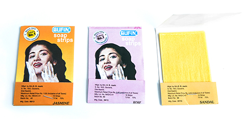
Conventional paper soap packages found in India
The visual intervention has been accomplished by exaggerating the form of the paper strips to reveal its ideological function. The two dimensional surface of paper is transformed into a textured three-dimensional surface. The paper is slit in the shape of an X at various places, the slits are folded outwards and the multiple strips of folded papers are layered on top of each other to create a texture. The soap strips used are brown and white in color. This visual treatment is used as a metaphor for skin. The object can be appreciated for the beautiful intricate pattern before peeling showcases rich texture due to the layered brown and white paper. However, the patterns start to fade as the user peels through the layers of soap. The color transitions from an intricately crafted brown surface to a blank white space. The effect of this transformation is strengthened, as the user is directly responsible for the act of peeling.
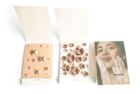
Morphed paper soap package titled “Pigment”
The related shape and scale contribute in enhancing the experience of the human body with the modified artifact. The object visualizes notions of beauty and skin color as being relative and ironically presents it to a viewer. Once opened, the modified content of the package imparts unexpected information that forces a viewer to consciously evaluate the visuals consumed in a culture. Additionally, due to its coarse nature, the texture can be interpreted as a grater, implying that by using these soap strips one can scrape off skin color. This complies with the cultural notion of using soap to lighten skin color. The experience of using the soap is intensified due to the sharp folded edges of paper which further lends to a violent visual.
Clay Cup (Kulhad)
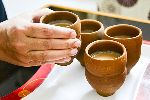
Conventional form of a clay cup (kulhad) found in India
The third object selected is a clay cup called Kulhad, from an everyday Indian context. A kulhad is a cup made out of fired unpainted terra cotta. Clay cups are made in bulk by local potters and predominantly used for serving tea at roadside tea stalls. Kulhads are meant to be smashed on the ground once their purpose is fulfilled. Since they are made out of clay their disposal is easy and environmentally friendly. They have been valued for their materiality and the effect they have on the aroma of the tea. Breathing in the aroma of the tea is essential to the experience of drinking from the clay cup. Even though clay cups have many merits, they are now being replaced with plastic.
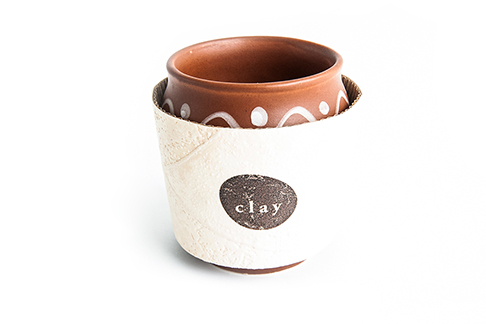
A kulhad wrapped in the designed textured sleeve
The intent of the investigation was to defamiliarize a kulhad in Indian culture in order for it to be looked at as an object worthy of rediscovery and not forgotten with time. The Kulhad is juxtaposed with a disposable coffee sleeve, conventionally found in a western context in order to make the clay cup unfamiliar. The coffee sleeve imitates the texture of a clay cup and is branded as “clay.” For an Indian in a western cultural context, a coffee cup wrapped in this sleeve poses as a substitute for the experience of holding a clay cup and the feeling of its textured surface. The textured sleeve evokes nostalgia and can be marketed to Indians living away from home.
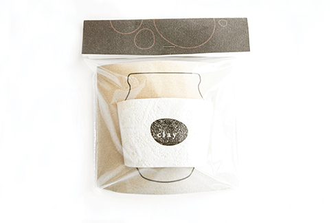
A packaged designed textured sleeve
In India, a kulhad wrapped in this sleeve would appear strange. This juxtaposition is created to rediscover the kulhad by drawing attention to its qualities. In keeping with their origins, the altered sleeve and the clay cup each retain their conventional proportions. The sleeve meant for a coffee cup placed on a palm-sized kulhad produces a disjointed image— the sleeve consumes the clay cup so that only its rim can be seen. Physically a kulhad wrapped in a sleeve would be protected from being broken into pieces. Visually, the sleeve signifies that the clay cup is a precious and valued artifact that needs to be cared for and protected. However, in actual use, the sleeve functions as an obstruction. This experience calls to question what it means to add value to objects. The component that is meant to add value in fact diminishes it, thus bringing to light the worth of the original.
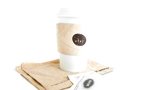
The textured sleeve in use in a western context, wrapping a coffee cup
To summarize, these objects that fly and float can integrate in the Indian culture and can perform two functions. First, they can enable a discourse on design and its role in the everyday. Second, they can make an audience conscious of their habitual responses to quotidian life through graphic design. Consequently, these transformed objects challenge an audience to recognize the ideologies perpetuated in a culture through everyday objects.
Malika Soin is a communication designer born and brought up in India, presently based in Toronto, Canada. Her interests lie in investigating everyday culture, how culture has the power to influence design and how design can have an influence on culture. The current essay was excerpted from her 2015 MDES thesis at York University. malikasoin.com





Leave a Reply
You must be logged in to post a comment.