David Stairs
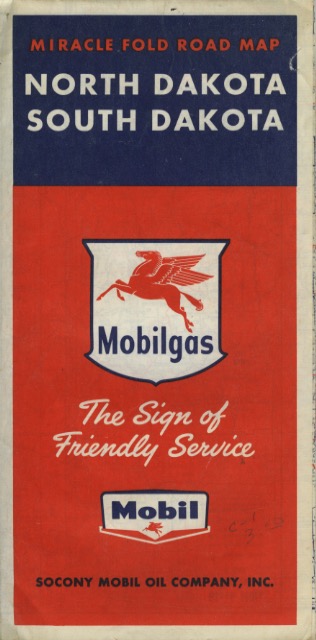
When I think of blue and red the notion of Democrat and Republican naturally come to mind. One can find any number of red-blue maps online that attempt to represent our political differences. I even wrote about it here after the last Presidential election. Happily, there is another, earlier visual application of red and blue: the road maps of the 1930s to 1950s.
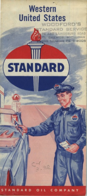
I’ve known about these for a few years, but the uniqueness of the genre was recently brought home to me by some of my students who were working on a design vernacular assignment. The state and regional road maps used to be offered by most oil companies at their gas stations as a complimentary service.
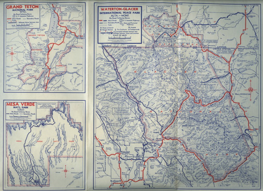
The ones I own were published for Amoco and Standard Oil. One of my students recently purchased one offered by Mobil. These detailed road maps are always printed in blue and red, the better to keep the cost low while highlighting special details. One of my maps of the western U.S. has detailed pop-out maps of several of the most famous national parks.
Courtesy: Austin Wirgau
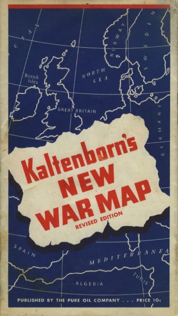
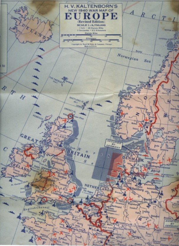
One day one of my students brought in a rare find. Entitled Kaltenborn’s New War Map, one side is a map of the world, the other a map of Europe during 1940, the first year of WWII.
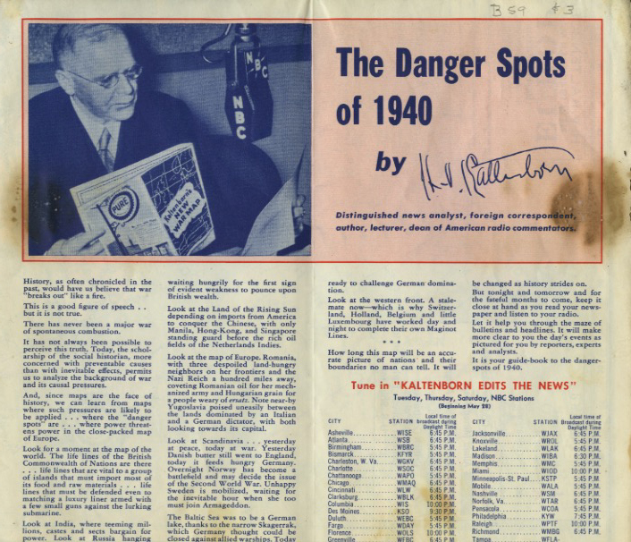
The document includes comments by famed radio news analyst H.V. Kaltenborn and a European map that gives indications of naval blockades, air fields, and reinforced positions, like the Maginot Line, and all for only 10¢. True to form, it was published by the Pure Oil Company.
These are different from the AAA’s famous Trip Tiks, which are still in use, and are more modest than the book-style Rand McNally Road Atlases one can purchase.
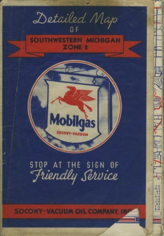
Courtesy: Nate Morrison
But I love their simple utilitarian look, and enjoy the way they collapse to inside jacket pocket size. Map Folding 101 used to be requisite knowledge for any driver. Now it’s a lost art, like rendering the world in blue and red.
David Stairs is the founding editor of the Design-Altruism-Project









Leave a Reply
You must be logged in to post a comment.