David Stairs
Have you ever been in a super loud environment? I don’t mean the usual sort, like a kindergarten classroom or a football stadium on an autumn weekend— a scene of audio cacaphony— I mean a visually loud room. The Victorians were sometimes guilty of visual clutter, with their knick-knack trophies and flowered wallpaper, but they had nothing on modern commercial interiors.
I’m certain you can think of such a place. Perhaps it is your local Walmart or Nike Store, with their ubiquitous logos. Or possibly, it’s your favorite restaurant chain, bedizened with food super-graphics and advertising. My candidate would be Planet Fitness, the health and fitness chain alternative I was left with when my local on-campus workout place closed in 2017.
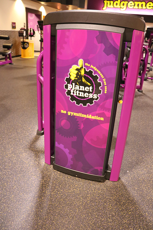
Nevermind the numerous large-screen televisions conveying their tawdry menu of over-produced gorp, from Jerry Springer to music videos and cooking shows. Disregard the horrible music spewing from multiple speakers with its girl-pop lyrics and Fabreeze locker-room commercials. Planet Fitness is the visual equivalent of Dante’s 6th hell, and the fact we all take it for granted is indicative of how desensitized we’ve become.
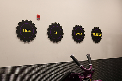
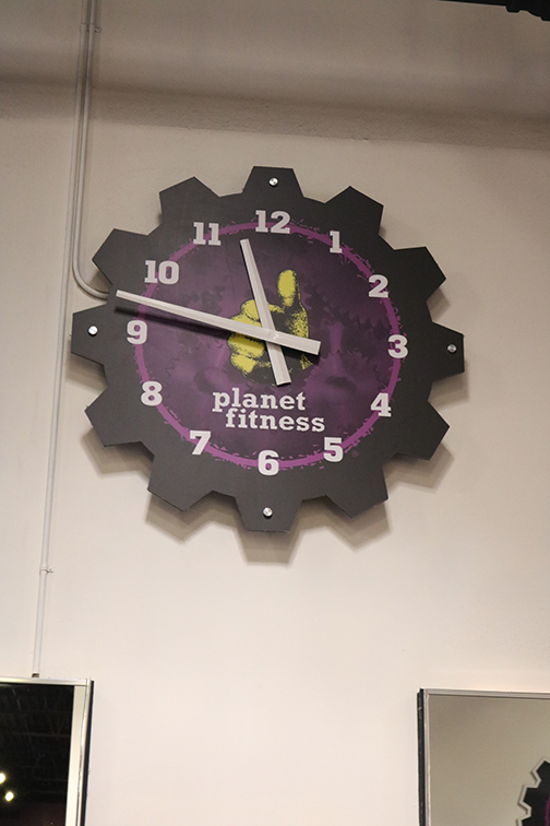
Uplifting gears at Planet Fitness (If only people cared as much about the actual planet!)
From the purple and yellow palette to the cutesy admonitions writ large on every wall, Planet Fitness is a designer’s wet dream, a place where restraint and good taste have to be checked at the door.
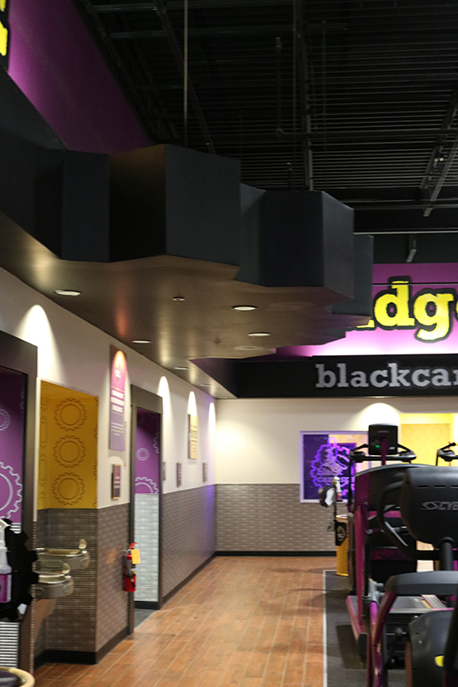
Ceiling gear above entrance to locker rooms
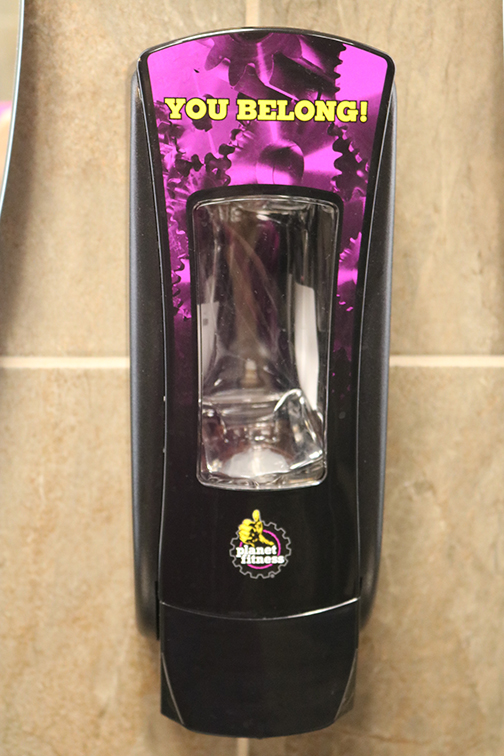
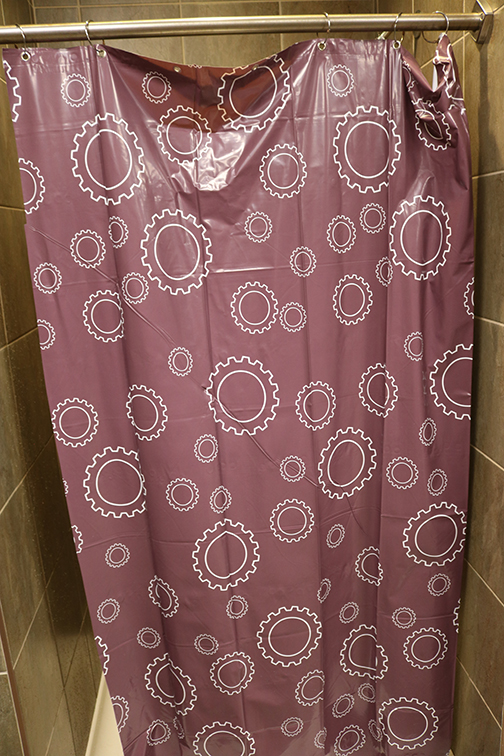
Every square foot is filled with corny references to gears, from the clock on the wall to the giant gears marking the service counter and locker entryway, even the wallpaper and shower curtains. Other than referencing a roomful of spinning machines, it’s a terrible way to symbolize human bodies in motion.
The PF “thumbs-up” logo is on every surface, from soap dispensers and hand driers in the locker room to the ass-end of every weight machine in the place. There’s even an etched-glass thumbs up window for the Black Card Spa, PF’s top members’ perk.
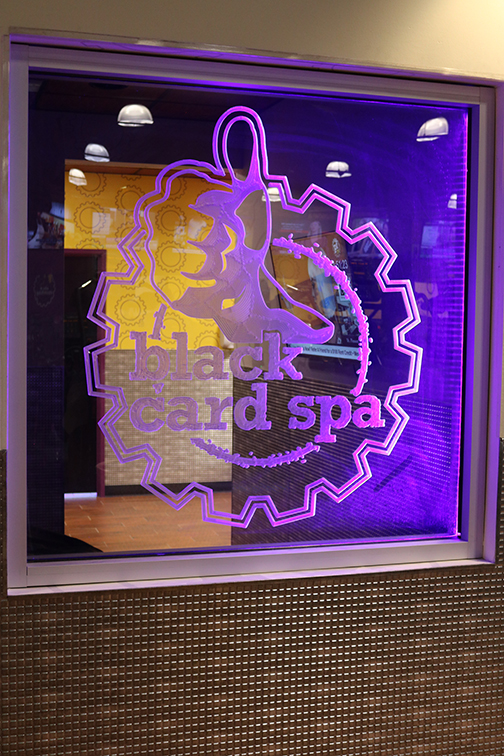
Such an interior can only be the result of branding run amok, designers so cluelessly fascinated with their own navel-gazing cleverness that they can’t grok the difference between promotion and propaganda.
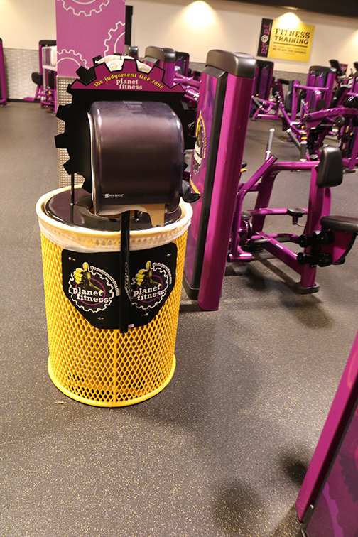
Branded trash container and towel dispenser
I’m certain there will be those among my readers who will think, “There can be no such thing as too much branding, only too little.” But I propose that, as banal as a gymnasium interior can be, to decorate said interior in a way that makes it both offensive to think about and painful to look at is to ultimately fail in one’s efforts.
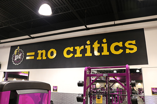
The extent to which Americans have permitted corporate over-branding of their private and public spaces is less a testament to the power of their vision than it is an example of their collective blindness. How we got here is obvious. Less clear is how we can return to creating sane spaces for human work and play.
David Stairs is the founding editor of the Design-Altruism-Project

