David Stairs
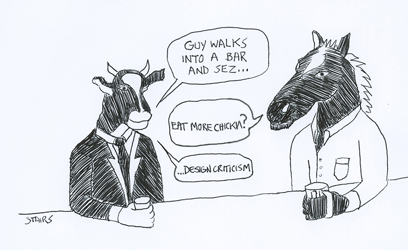
Last week I was talking with my 16-year-old about his piano lesson when I asked him whether his tutor had emailed him before rescheduling a recent lesson. “Dad,” he chuckled, “I can’t believe you said that.” Translation: no one of sound mind uses anything but text as a means of communicating these days. I reminded him that not long ago I might have wondered if his instructor had “called” him with the message, but the point was made. There isn’t a day that passes when I am not reminded of how quickly I’m obsolescing.
Recently this came home to me in another way when I read Justin Zhuang’s post on the AIGA Eye on Design site entitled The Seriously Lighter Side of Design Criticism. Zhuang is a graduate of SVA’s MFA in Design Criticism, and has written extensively on design in Singapore. For the AIGA he was commenting on three sites: Zander Brade’s The Passable Designer, Christopher Simmons’ The Message is Medium Rare, and Edwin and Krisztina Heathcote’s Reading Design. The latter is really just a compilation site, so I’ll focus most of my comments on the first two examples.
Zhuang’s thesis-in-a-nut-shell is that these sites demonstrate “…how critical writing about design can be smart, funny, and unexpected.” The Message is Medium Rare, is a blog of about three dozen ruminations, “lessons” Simmons’ gleans when comparing design and life while eating “America’s favorite food,” the not-so-humble hamburger. Simmons is the principle at MINE, a San Francisco design studio, and an adjunct faculty member at California College of Art.
According to Simmons, he launched this “side project” when he and his colleagues began critiquing their burgers at lunch. “As designers,” he informs us, “we tend to be critical of the world around us, even when we’re just at lunch.” The blog proved so popular that within a month of launch he was logging 40,000 unique visits. This did not surprise me. Simmons is well known and liked in the Bay Area design world, and his column is witty and urbane. And, after all, the 17th century inventor of the essay, Michel De Montaigne himself, was famously lighthearted in his choice of subject matter (He once wrote an essay entitled “Of Thumbs”).
The Passable Designer, London designer Zander Brade’s satirical design news site, self-describes as “Breathtakingly honest coverage of the world’s least self-absorbed industry.” By creating a series of brief, ironic vignettes, Brade muses upon such design profession pitfalls as job jumping, workaholism, and the horrors of bad kerning, while struggling to seem not too self-absorbed. In one passage he laments the time wasted discussing the limits of the hated typeface Comic Sans: “Despite the conversation not being interesting in any way, shape, or form, and had consisted now for a full thirty six minutes of little more than joking complaints that Comic Sans should never have existed, the group proudly soldiered on.” Spending 36 minutes making shop talk in an era when one could be following tweets is indeed a deplorable waste.
False irony aside, not only do I risk revealing myself here as a Sanctimonious Old Fart, but by taking on young graduates of MFA design criticism programs, a self-taught outsider like me also exposes himself as a Humorless Sanctimonious Old Fart Who Still Uses Email. But, oddly enough, I don’t actually have a reputation for being humorless. In fact, my work has long been considered funny and transgressive. So why do I fail to appreciate the humor in Zhuang’s choices?
One of the things that set me off was Zhuang’s opening salvo. He writes: “If the term ‘design criticism’ brings to mind long, rambling essays that pale in comparison to their accompanying images and layout— you know, the serious, yawn-inducing stuff most word-averse designers feel duty-bound to plow through…” As an academic, I and my colleagues fight an ongoing, and apparently losing, battle with anti-literacy. I can’t speak for Simmons’ students at CCA, but my design students at a mid-west land grant institution are seriously aground on the shoals of “word aversion.” Perhaps this is because most of what they are forced to read is not interesting to them, but the contention also seems to be that perhaps serious stuff is just not as entertaining as the things they prefer to read. Another way to look at it is to suggest that most dreary old design text only exists by virtue of its supporting graphics and layout, and this is another sort of scary.
While I recognize that the writing formats of a living language vary and evolve, just as the language itself does, there seems to me to be a distinction between criticism, which is evaluative, and rhetoric, which is meant to carry the moment. The ancient art of persuasion exists in our society in politics, advertising, and the law. Modern criticism is more derivative of dialectic or philosophical thought. For a real head-busting explanation of these matters check out the Wikipedia entry for rhetoric.
Perhaps I’m placing too much emphasis on what I perceive as substance, a slippery slope if there ever was one. I’m not opposed to people obsessing about burgers, although there are certainly enough foodie blogs doing that already. But we are saturated with triviality every day, and advertising has an uncanny way of converting the deep into the superficial, often with the overt assistance of the design profession. The Heathcote Reading Design compilation actually co-opts works by 20th c. heavies, like science sociologist Bruno Latour. And Simmons’ blog cites one of the primary rhetoricians of the 20th century in his blog’s title, although few of my students would get this. So, to quote an infamous bit of 80s ad rhetoric somewhat germane to Simmons’ blog, “Where’s the beef?”
The mystic 18th century poet William Blake could “See a world in a grain of sand…,” but I feel we overreach when we see design in every grain of sand, let alone start living our lives according to the iterative process. Granted, criticism is an art, not a science and, as such, is more subject to style than methodological rigor. And there’s nothing hipsters like more than the idea of being “edgy;” it’s the ultimate nod to lifestyle fetishism. But when style is too self-consciously clever, when it self-defines as critical while giving a wink-and-a-nod to literacy, when, in passing, it lulls its audience into a self-gratified state without requiring much from them in return we’ve left the domain of criticism and entered the realm of amusement. And there, my dear readers, the joke sits squarely, resolutely, and ponderously upon us.
David Stairs is the founding editor and original curmudgeon of Design-Altruism-Project.





Leave a Reply
You must be logged in to post a comment.